Ever have the passing premonition that you just mastered your discipline and already it's about to become outdated? I don't suppose it happens very often... either you're going into a fresh field that's got a lot of rich territory to conquer (nanorobotics?) or you're entering something that's proven permanently useful (nursing). I guess we all hope our profession is some idealized combination of those two... so practical, and yet with so much room to grow. For me, that's graphic design: something we all need, as long as we have mass production and advertising, and something that gives vast room for new innovation and creative freedom.
But when I see something like this, Jeff Han's insane multi-touch technology, sometimes it gives me the fleeting sense that I just won't be able to keep up, no matter how attentive I am to design and aesthetics. This shit is going to change my industry, along with the whole meta-industry of information technology, and dozens of sub-disciplines that are affected by it.
This should excite me, and let me tell you, it does. I was excited about it back when I saw it in Minority Report, before I had any idea that it was really on the horizon. Now I can start to see what it's going to do for interface technology. Through college, and in my current job, I've been learning to design for a certain very specific gesture that the mouse is based on: hovering and clicking, or hunting and pecking. It's been all about hot-spots and discreet areas on-screen, making certain things look intuitively like buttons, or tabs, or handles: one focal point at all times. With the mouse, we're still searching, focusing, and working in a simple sequence.
The multi-touch screen is going to make our experience more truly tactile. Now, we're going to be working with both hands at a time, holding one thing while we press another, integrating depth (i.e. pressure) and relationships (i.e. between fingers). It's a bunch of new axes, and it's going to require a whole new way of thinking... probably less like pointing at a picture and more like playing an instrument. I'm not sure I'm prepared to design this way, and I have a feeling it's going to take over the things I've been specializing in.
Even so, the possibilities are amazing. The old discreet systems of keyboard (strict set number of symbols in memorized positions) and mouse (one point at a time, searching and focusing at one area of the screen) weren't really cut out for the new wave of digital production. Some of my friends have asked, "What makes this so great, anyway? I don't see any problem with my on-screen controls..." And if they're using MS Word and Internet Explorer, they're probably right.
But the new wave of production specialists are going to be doing some amazing shit with this technology. In 3D graphics programs, we've traditionally been trying to translate three degrees of control into the two degrees available on-screen, and worse yet, we've been doing it with a one-dimensional mouse pointer. Now we can have the equivalent of three pointers on-screen at once, moving intuitively according to our gestures, and furthermore, we can use pressure to add another dimension. Controlling all those variables at once, what might the 3D artist of the future be able to do? Real-time modeling? What do you think: a 3DJ?
And speaking of DJ, how about video jockeys, those guys who do real-time video mixing along with music? That's another media space where keyboards often don't really cut it... you're working with dozens of factors, including frame-rate, hue and saturation, multiple clips and timelines, opacity, multiplication and repetition, and you're expected to do it all in response to the music you're listening to. It's hard to translate your listening habits into keyboard pokes, or (even worse) hunt-and-click mouse behavior... but with gestures, speed tracking, pressure sensitivity, point-to-point relationships, and all those other ridiculous variables that this technology allows, VJing could become more like dancing. This is a space for the artist of the future, hyper-complex and hyper-sensitive to all senses, to emerge and take over mass culture.
Don't discount the possibility that this will make your everyday tasks more intuitive, either. Replace the back-space key with a simple act of rubbing a word off the computer screen. Even more intuitive: watch that video to see Jeff Han group photos and organize images with his hands, like shuffling them around on an infinitely-large light table.
This is the future, people. It's some amazing shit.
Monday, May 21, 2007

Tuesday, May 15, 2007
Jerry and Jean: The split ends of ideology
Celebrity deaths are a few among the many posting opportunities I missed recently... I never said anything about James Brown or Anna Nicole Smith, and I wish I had, because these were cultural icons worthy of note. Another one kicked it today, and I think I'm gonna take the opportunity to make up for lost time.
The man in question was Jerry Falwell. He was quite a shit-kicker in the political and social domain, a die-hard member of the "rude disrespectful uber-conservative" clique that also includes Fred Phelps, Jack Thompson, Rush Limbaugh, and Ann Coulter. He's gone through a whole spectrum of socially conservative beliefs... and I only characterize them as such because I'm a very level-headed critic. Most of my friends would call them "regressive," "patently indefensible," and/or "retarded." These positions include segregationism early in his career (he supposedly reformed this belief, probably when he realized racist legislation wasn't really going anywhere); dubious positions on Apartheid; that (in his own words) "AIDs is the wrath of a just God against homosexuals"; that secular education is tearing at the fabric of our society; and that 9/11 heralds the apocalypse.
Just today, Falwell died of sudden cardiac failure, or something like that.
Falwell doesn't really represent a noteworthy demographic, because I believe (with hope) that not enough people agree with him to call it a "demographic." However, he definitely represents a subsection of American popular culture, and a disproportionate amount of the American media consciousness. Even as Falwell discredited his own party, he probably always accomplished his goal: he shifted the public discourse back into a domain of "morality" and "social norms" and the need for God as a political icon.
This whole thing actually makes me think of another public figure, less public than Falwell, but much more influential in the intellectual world, and a worthy foil for the present discussion. That's Jean Baudrillard, who died this past March. Baudrillard was for the left what Falwell was the the right: a sort of ideological extremist, a man at the far limit of the attitudes he embodied. Baudrillard was famous for his analysis of simulacra and simulation, and for the idea that representation has taken over reality, and of the experience of it. Glance at his Wikipedia article. It's a surprisingly good discussion of such a complex thinker.
Where Falwell was a great institutionalist, believer in social, moral, and divine regulation of our thoughts, actions, and behaviors, Baudrillard was an institutional iconoclast, attacking (sometimes excessively) the foundations of our identities and beliefs. He saw all the totems of our belief structure -- truth and falsity, good and evil, gender, war, politics, and media -- as arbitrary inventions of a faceless society and an alien consciousness. Baudrillard referred to himself as a nihilist, meaning he saw every given and argued truth as a groundless representation of something we can never reach.
Where Falwell was a reactionary, Baudrillard was a radical. Where Falwell was an epitome of the narrow mind, devoid of any perspective on the world, Baudrillard was the epitome of a jaded postmodernist, a man without faith.
Karma (or nature, or fate, or whatever unconscious mechanism is running our universe) balances the scales of ideology, and once again, the cultural landscape is smoothed out, ever so slightly. I hope these two fuckers are having one hell of a conversation in whatever strange afterlife will take them both.
Tuesday, May 01, 2007
Like a cast shadow: Remind Me (Royksopp) and Agenda Suicide (The Faint)
Remember, not too long ago, I mentioned this term by Eco, “riding the same cultural wave?” It’s a concept I’ve appropriated and adapted more or less beyond recognition, but it continues to serve me well, because I’m always finding strange correlations between apparently unrelated art and entertainment design. Tonight, it’s music videos.
The videos: Agenda Suicide by The Faint and Remind Me byRoyksopp. Part of the point of the post: to draw attention to these two brilliant, beautiful music videos, so everyone can pause and appreciate the wonderful things you can do with an idea these days.
When I think back on my dreams, I notice that they never feel like a continuous environment to me. My dream-space is almost like a stage, or a movie set, artificially extended but essentially tiny and set aside from anything like a real world. Both of these videos make me feel that way, as well.
This loss of immediacy sends the videos to two different places: for the Faint, it’s self-destruction. For Royksopp, it’s transcendence.
END NOTES:
Sunday, April 15, 2007
Grindhouse: More needle, more red
Okay, so in this last post, I discussed two musical acts, Samiam and The Go! Team, simulating lo-fi recording quality to various effects in recent albums. Well, I went and saw Grindhouse not too long ago, and guess what? It's related!
Grindhouse is a ton of mindless fun if you need something fast-paced and laughable to get you through a boring evening. If you want a review whose tone parallels the movie, check this one out. If you don't like the review, there's a good chance you won't like the double-feature. As for me, I liked them both. And for those who took an interest, Rodriguez is apparently making the Machete film whose mock-trailer appeared before Planet Terror. The awesomeness is propagating.
On to the (I guess) point of the post, though. To make this kitschy reference-fest really work, both Tarantino and Rodriguez had to emulate some old stylistic quirks that filmmakers haven't had to deal with in a long time. Pretty much all of Planet Terror was treated with film grain and strange color shifts, and Death Proof started out with a lot of strange cuts, bad editing, and sloppy production. Again, we're talking about the same stuff as we saw in The Go! Team and Samiam... the intentional emulation of production issues for the sake of a tone, stylization, or conceptual treatment.
A friend mentioned to me that Tarantino's editing flubs were less consistent than Rodriguez's. At first, Death Proof seemed to be a real editing mess, with certain scenes cut awkwardly or repeated. However, as it went on, it became fairly clean and well-produced, right up until the end when there was a five-minute beat down taken directly from one of my own 8-year old video game fantasies. Rodqiguez's color shifts and film grain were more consistent, applied throughout the whole movie. This could be construed as a couple points in favor of Rodriguez's style, and against Tarantino's.
But when I think back on it, the consistency and intensity of Rodriguez's treatment made it seem profoundly intentional, even to the point of being artificial. In this sense, because it was so evenly lo-fi, Planet Terror was thoroughly kitsch. Tarantino's bad editing, because it only intervened at a few key moments in the film, felt more cohesive and more believable. It's almost inconceivable that Rodriguez shot on really crappy film and that all his color shifts were natural and authentic. On the other hand, I could really believe Tarantino's editing screw-ups occurred because he didn't bother cleaning up the rough cut of his footage.
So according to my reading, Rodriguez's lo-fi was kitsch (a.k.a. reference, homage, in-joke). Tarantino's was a genuine aesthetic (i.e. a creative element, a theme).
We can look at the previous discussion in this light, too... Samiam's lo-fi could have been, and probably WAS, the result of a careful discussion and an authentically lo-fi recording session. The muddy sound was an aesthetic. The Go! Team's cracks and pops were more of a device, conspicuously left in the carefully remixed and reproduced music, to give homage, and as such, they were unnaturally conspicuous. For Samiam, lo-fi was a concept. For The Go! Team, it was a stylization.
Concept versus style, aesthetic versus homage... I'm such a goddamn graphic design nerd.
Wednesday, March 28, 2007
First Quarter Movie Trailer Wrap-Up
I've been really slow on the media criticism lately, so I though I'd get back in practice, and play some catch-up, by reviewing a bunch of the trailers I've missed over at Apple Trailers. There are a number of interesting things mixed in with all the boring-looking, formulaic crap. I've mentioned some highlights below.
Vacancy - It's probably worth seeing Luke Wilson in a different kind of role, for the same reason we gave Jim Carrey a chance in The Truman Show. This is also a stripped-down horror plot that still seems compelling, and that's hard to manage these days... with movies like Final Destination and The Invisible, and even The Ring, reaching into more elaborate and sketchy dramatic mechanisms, I'm willing to give a shot to a good old locked-in-an-abandoned-room suspense thriller.
Day Watch - You probably haven't seen Night Watch. You should. You don't hear much about, or from, Russia, and they're developing a pretty cool franchise right under your nose.
Nomad - There's something that promises to destroy this movie, if even a few people notice it... a bad coincidence in timing and promotion. All it takes is one word, or geographical reference, linking it to a big film phenomenon with which it would not want to be associated.
Slow Burn - I have to give it credit for combining some interesting thematic elements and stylizations. What do these terms have common? : visibility - light - color - ethnicity - representation - simulation - truth - deception - darkness -
Resident Evil: Extinction - The last couple Resident Evil trailers (including this one) seem to be excuses for visual effects people to mess with reality in masturbatory ways. Somebody had an awesome time modeling Vegas, and all of the planet Earth, as a dystopian wasteland, and they really needed to show it off. There was probably a dude in the next office who was like, "You're doing that? Well, shit... I'm gonna make a fake futuristic commercial for Vegas Tourism, and then I'm gonna have it break up into static and intereference." These are the people that made the first half of the trailer kind of cool. The last half is kind of boring.
Paprika - Sometimes all it takes to sell a movie is a few clips. If that's true of any director, Satoshi Kon is that guy. His other films - Perfect Blue being a personal favorite - are all masterpieces. Of course, this particular trailer has the added bonus of a rad song in the background.
Penelope - Christina Ricci in a role I'm excited about. I was a little disillusioned at her Black Snake Moan role, where she lost all but a booger's worth of waist and got victimized for a couple hours. It looks like a cute movie. I REALLY hope it doesn't blow its "ugly duckling" load and end up with a happy conclusion that involves the protagonist becoming conventionally beautiful. Shrek knew what it was doing on this one.
Jindabyne - Reminiscent of Deliverance, and I hope the existential dread factor is comparable. If you want a preview of the story, which sounds deliciously ambiguous, read the description. If you want a preview of the tone and mood, which is heavy on mysticism and lurking darkness, watch the trailer.
In the Land of Women - Looked like it could be cool for a while... the effect of age in romantic/sexual power dynamics is something worth exploring in a new way. Unfortunately, the big kiss with the music pick-up was an abominable addition to the trailer, and it erased any interest I have in seeing the actual movie.
Wild Tigers I Have Known - This fits in a special category of movies for me: things that look fascinating, and that I should definitely see, but rarely get around to watching. Brothers of the Head is in there, and until recently, all of Almodovar's movies were in that list, as well. The trailer is surreal and beautiful, and the write-up may make you more interested, or less interested, depending on how much a concrete plot summary appeals to you.
Wednesday, March 21, 2007
The Go! Team and Samiam with needles in the red

Just downloaded The Go! Team's album Thunder, Lightning, Strike, and I can't stop listening to it. Am I the last person to hear about this? Is this blog entry gonna date me, like, two years and twenty hipster credibility points? It's an unexpected, addictive little album, purely and painfully anthemic. This isn't music that makes you lock yourself up and contemplate... this is soundtrack music, stimulating enough that the stimulation seeps into the rest of your activities. Some music turns you inward -- The Go! Team, playing remixed superhero disco anthems with middle school chants, turns you outward and gets into the rest of the world through you.
The album has a nostalgia about it. Now, I personally have an aversion to things that are self-consciously nostalgic, just like I have issues with "retro" and "kitsch." It's a neophilic instinct, not wanting to assume that people used to do things better, or be better off, than we are today. I have a theory that such nostalgic assumptions are a bad mental habit that we've picked up as we've filled out our cultural memory, and I assert myself as an idealist and a progressivist who thinks things are getting better in the long run, or if they're not, at least they're not getting worse.
Still, there's something to be said for feeling like a part of a long history, even if I wasn't around to appreciate most of that history. Thunder, Lightning, Strike invokes a Brooklyn of the 70's, with afro-haired disco queens and kids in bell-bottoms on street corners. You get the same nostalgia when you see a fire hydrant broken open in Harlem... it still happens, but it's an icon of an earlier time. I'm telling you, I wasn't even there for any of this. I was born in '82. Still, media has turned us all into time-traveling immortals, and just as I've seen Colonial Williamsburg on school trips, I've also seen life in the '70s through movies like The Warriors.
One of the ways The Go! Team manages this kind of nostalgia -- besides using basically all the raw elements of music from the '70's, including melodies, riffs, samples, and instrumentation -- is to record and produce their album with a lo-fi texture. Pitchfork Magazine mentioned this in their review of the United States release... they called it "needle-in-the-red sensibilities." It's the mark of authenticity in lo-fi recording, the testament that somebody recorded on an 8-track and had to fiddle with Radio Shack wires, instead of paying tons of record company cash to waltz into an outfitted studio.
There's something funny about this device, though. These days, recording and remastering equipment is so cheap and available that there never needs to be a drop in recording quality. It's a form of fakery, making your sound buzzy so it fits into an older aesthetic. I'm tempted to say, though, that in the 70's and 80's, when this aesthetic was unavoidable, it wasn't harnessed or respected by these artists. It's made the transition from inevitability to novelty. So what is it contributing? Why did somebody make the creative decision to create an album with crappier fidelity?
There's another album I've listened to recently that harnessed the power of crappy recording. Samiam, a California post-hardcore band that was breaking emo ground back in the early '90's, has created a lot of very pretty, well-produced albums. They've been awesome, due purely to the band's talent and songwriting skills. You won't find a more profound dynamic anywhere in punk-influenced music.
But Samiam's last album, Whatever's Got You Down, wasn't studio-polished. The vocals were guttural and clumsy, and the instruments were muddy and loose. Some fans took offense at this. Why make your music sound like crap? You can make gorgeous sounds without stomping on it and running sandpaper over it.
Of course, I'm going to vigorously defend both of these stylistic choices. What I'd like to note is that these two bands both had reasons for their stylistic treatment, although these decisions were probably very different.
The Go! Team was definitely trying for nostalgia. The gritty texture is a way of turning CD's and digital audio back into magnetic tape, at least in some small way. The music isn't trying to break brand new innovative ground, or if it is, it's trying to do so through retreival of an aesthetic that's slipped out of style.
Samiam's situation is a little different... they come from an intersection of scene with a love-hate relationship with accessibility. Punk rock has always wanted to be "pop" in certain ways: simple, short, enjoyable, visceral, and driven by hooks and songwriting. In others, the DIY music scene has actively distanced itself from pop in favor of "artistry": they don't want to be mass-produced, limited by market concerns, or forced into legal and economic subservience to their merchandise and their distributors. Samiam has always been smart and independent, but like all good punks, their flirtation with "accessibility" has been intermittent. The lo-fi sound on Whatever's Got You Down was an assertion of the band's creative license in the face of pressures to post-produce, remix, and polish their sound for the hi-fi synthpop crowd.
In both cases, though, the sound quality was a statement, an active part of the sound rather than a passive barrier to be ignored or overcome. As with a lot of media phenomena, this goes back to Marshall McLuhan, the godfather of media studies. He noted that a medium tends to be transparent until it's replaced and made obselete, at which point it becomes an object of attention and a factor in the content. Digital audio and hi-fi recording has basically replaced the ticks and quirks of analog production, and finally, after fighting those crackles and pops since the days of the phonograph, we've finally come to a point where they're part of the language we have at our disposal.
Sunday, February 25, 2007
The Abandoned: A concise history of horror movie cliches
 So I keep seeing this poster for a new movie, The Abandoned, and I can't help thinking of... well... every horror movie made in the last ten years. I'm not saying it's bad. I'm not even into horror movies enough to make that call. But I've never seen a better example of a use of design encapsulating all the cliches of a cinema subculture. Let me list them for you, just for fun.
Note: this is a matter of breaking the poster down into codes, through which method I shall demonstrate that it's a beautiful permanent record of recent horror movie cliches... even ones you may not have noticed before.
1 - Representative content code #1: Doll
This cliche has been around for quite a while, and it's thoroughly representative of the trend in horror film in the last twenty years or so. We all remember Chucky the possessed toy in Childs' Play (I, II, III, IV, V?), and we've also seen posters for The Puppet Master and The Leprechaun. Somebody help me out... what exactly is it about dolls that makes them such an enigma, and so easily turned into an icon for disturbed psychology? Is it the artificiality, and thus the objectification and/or machination of the human body? Is it the soullessness implied by the unfocusing, unreactive eyes? Whatever it is, it's a hell of a theme.
2 - Representative content code #2: Bloody tears
This one is less common than the "deranged dolly" cliche, but it's still everywhere. Let's see... recent examples... it figured into a haunting nightmare scene in One Hour Photo, it was a core image in Madonna's Like a Prayer video, and apparently it happened in Stay Alive and Stigmata. Obviously part of the appeal is the emotional weight of injury and trauma, and part of it is the power of its Christian implications. In case you were wondering, there actually is a condition that causes you to cry blood. It's called Haemolacria.
3 - Stylistic device: cracked photo treatment
This is in reference to the fact that the image on this poster is riddled with cracks and decay, looking like something somebody pulled out of a pile of crap in a dusty attic. This is an classic horror movie thing, too, but especially recently: all the posters for Saw, Hostel, Nightwatch, Jeepers Creepers, The Hills Have Eyes, and even as far back as Rosemary's Baby had this kind of stylization, which sets you, as the audience, at a distance from the object of fear. After all, if you give it too much of a face and too much of an identity, especially in the movie poster, you're ruining the punchline of seeing the monster in his full glory for the first time.
4 - Title Convention: The BLAHBLAH
I keep seeing horror movies with one-word titles, preceeded by the article "The". Now, the absolute paradigm case is a plural group of people identified under an ambiguous title, such as "The Messengers," "The Innocents," "The Others," "The Ugly," "The Unborn," "The Brood," or "The Uninvited." The Abandoned falls right into that core group... a non-specific description of a faceless, soulless mass that waits outside your door, living dead style. Of course, if you expand your horizons a little, you get a TON of other movies with "The..." titles: The Ring, The Grudge, The Birds, The Thing, The Exorcist, The Antichrist, The Beast, The Believers, The Beyond, The Burning, The Cave, The Cell, The Changeling...
God. There are so many. I shouldn't have started with the horror movie list.
Anyway, that's my observation for the day. I think we should commend the marketing geniuses behind The Abandoned for giving us such a concise record of horror culture, without a whole lot of extra "creative" stuff to water it down.
A question, perhaps for my readers ("The Nonexistent")... how much of this stuff goes back to literary horror? Obviously bloody tears go back to the bible, more or less. How about the other codes? It strikes me that "creepy dolly" themes are fairly recent, but they could potentially be traced as far back as The Golem from Jewish folklore. The "cracked photo" themes? Probably pretty recent, especially since they seem to depend on reproduction and alteration of illustrations. How about "The BLAHBLAH"? Were there a lot of horror stories with such titles, back before horror was truly a cinema phenomenon?
As someone who's outside the horror culture, these are questions I'm not qualified to answer. Does anyone have anything for me?
Wednesday, February 07, 2007
The Marine versus The Rundown: It pays to recycle
Okay, remember this post, way back in the day? Well, I finally saw the second of the two movies to which it referred, John Cena's The Marine. At least, I think I saw two movies.
Okay, I'm going to start by saying this: it's not my intention to make fun of these movies for being similar, or to make snarky comments about how they were, like, TOTALLY the same movie, or Cena couldn't do better than The Rock so he did the same damn thing, or anything like that. My point is to look at my experience as a movie-watcher, and to ask myself: why can't I see The Marine as anything but a watered-down version of The Rundown? Will I ever be able to get over that?
Bottom line, though: there are dozens of minor cosmetic similarities. Let me list them.
Was it a pure case of a rip-off, intentional or unintentional? I'll wager that a lot of people in charge of The Marine had already seen The Rundown, maybe even recently... did they decide to recycle the same techniques in another ridiculous, even less successful action movie? Did they write "Cena hits henchman with burning plank," and think, WOW! THAT'S THE BEST IDEA EVER, not realizing that it surfaced from their subconscious mind?
Or was it what Umberto Eco calls "riding the same cultural wave"? Maybe the cultural influence doesn't just affect our general ideas about style and entertainment... maybe, somewhere in the collective unconscious, there's a voice saying, "WHY SO ANGRY?" to all of us, and maybe these WWE-based writers are just especially attuned to it. Maybe our media culture feeds us EVERYTHING, right down to the dialogue we write, and ends up sneaking the same lines and visual effects into unrelated movies, just because they both sprang up in the same cinematic/narrative era.
That's the coolest conclusion I could come up with. Here's my ultimate advice: if you see The Marine, make sure you also see The Rundown. The Marine is a good action movie, worth a weekend evening, but it couldn't compete with The Rundown, and I hope it wasn't trying.
Okay, I'm going to start by saying this: it's not my intention to make fun of these movies for being similar, or to make snarky comments about how they were, like, TOTALLY the same movie, or Cena couldn't do better than The Rock so he did the same damn thing, or anything like that. My point is to look at my experience as a movie-watcher, and to ask myself: why can't I see The Marine as anything but a watered-down version of The Rundown? Will I ever be able to get over that?
Bottom line, though: there are dozens of minor cosmetic similarities. Let me list them.
- The obvious similarity: both are action movies whose lead roles are beefy, violent, exiled mavericks, played by dirty WWE champions in tight shirts.
- Both shot in jungle-like tropical settings, involving a lot of traipsing through the woods.
- Both include a fight scene where somebody gets smashed in the head with a plank that's burning at the end.
- Both include a vehicle flying off a cliff and landing in a pool of water while its passengers plummet down same cliff, miraculously escaping said vehicle and surviving.
- Both include dialouge where two options ("Option A... Option B") are explicitly outlined.
- Both use a specific close-up, slow-motion graphical technique: in The Marine, this only happens once, at the beginning, when the shell from the shotgun flies through the air. In The Rundown, it happens all throughout the final firefight scene.
- Both climax with a slow-motion shot of the hero moving slowly away from a huge explosion.
- Both include the line "Why so angry?!?" yelled by a nerd to the beefy main character who's subduing him.
Was it a pure case of a rip-off, intentional or unintentional? I'll wager that a lot of people in charge of The Marine had already seen The Rundown, maybe even recently... did they decide to recycle the same techniques in another ridiculous, even less successful action movie? Did they write "Cena hits henchman with burning plank," and think, WOW! THAT'S THE BEST IDEA EVER, not realizing that it surfaced from their subconscious mind?
Or was it what Umberto Eco calls "riding the same cultural wave"? Maybe the cultural influence doesn't just affect our general ideas about style and entertainment... maybe, somewhere in the collective unconscious, there's a voice saying, "WHY SO ANGRY?" to all of us, and maybe these WWE-based writers are just especially attuned to it. Maybe our media culture feeds us EVERYTHING, right down to the dialogue we write, and ends up sneaking the same lines and visual effects into unrelated movies, just because they both sprang up in the same cinematic/narrative era.
That's the coolest conclusion I could come up with. Here's my ultimate advice: if you see The Marine, make sure you also see The Rundown. The Marine is a good action movie, worth a weekend evening, but it couldn't compete with The Rundown, and I hope it wasn't trying.
Saturday, January 27, 2007
Children of Men - Dipping a Finger Into Reality
I frankly don’t understand a lot of the negative reaction to Children of Men. I mean, it didn’t get all that much openly negative reaction - it has a 90% on Rotten Tomatoes - but a significant number of the positive reviews are laced with vague caveats, and I can’t understand what criticisms they’re trying to level. I saw the film, and I found it almost flawless, provided it’s taken on its own terms. A lot of these reviews were looking for something extra that they’re used to finding in movies.
The most obvious, and (in my opinion) the silliest, of these is the case of blogger violet., who was clearly looking for an opportunity to watch the book. Her instrumental sentence is, "So many things wrong, so many things missed. It could have been a great film, having had such rich material to work with.”
So you missed the in-depth reflections that the book brought to the story, in a one-and-a-half hour film, produced with a no-bullshit aesthetic that made its point by refusing to lean on cinematic clichés like flashbacks and contrived dialogue? I’m happy that most bloggers aren’t filmmakers.
A little more confusing is an opinion like James Berardinelli’s, on Reelviews. To James’ credit, he gave the movie a pretty good score (three out of four) and he didn’t fall into the same trap that violet. fell into; he makes it clear that he can distance the cinematic version from the book version, and that he appreciates it for what it is: “The script underwent several revisions, and each one took it further from the source material. This isn't necessarily a bad thing.”
Berardinelli goes on to mention a number of the features that made Children of Men so impressive: the frank, unflinching portrayal of violence, the unbelievable camera work, and the themes of moral ambiguity. So why does he give the film three stars, instead of four? He never actually explains this decision. In his last paragraph, he suggests that he wanted less action and more reflection (“Stripped bare, this is essentially a chase movie”), but when, in the last sentence, he calls it “imperfect,” I don’t really understand what he's talking about.
As for me, I’m going to discuss this film on its strong points. I concur, it wasn’t exactly meditative, and the character backgrounds were just there to frame the central “escape from LA”-style storyline, but these weren’t accidental oversights — they were smart stylistic decisions. The film clearly focused its energies on the escape from London, which was the central action of the plot, and the accompanying atmosphere of repression, desperation, and social cynicism. In this regard, it was an absolute triumph.
The camera work might be the deciding factor that made Children of Men one of the best, most suspenseful films of the decade, even though it wasn’t classed specifically as an action film. Most on-screen editing these days is made up of quick cuts with no more than ten seconds between them. Emmanuel Lubezki, director Alphonso Cuarón’s cinematographer, kept his camera running for significant lengths of time, from thirty seconds to as long as five minutes, even through high-intensity action sequences. Most film students are discouraged from using lengthy shots, because they can get boring (thirty seconds of a medium shot during a conversation — who would ever want to watch that?) but Cuarón and Lubezki keep it interesting by creating long sequences of hand-held shots, approaching the subject, withdrawing, panning, following, and generally keeping up with the actors.
This isn’t just a minor stylistic detail — the camera work ends up creating the sensation that informs the whole movie. In effect, the unbroken shots mimic the perspective of a live observer, someone who can’t arbitrarily change position, and who’s so transfixed by the action that they can’t look away. Other films' quick cuts and sequences of shots are stimulating in themselves, but they distance us from the actual action going on on-screen. The camera work in Children of Men, by contrast, was so immersive that I felt uneasy during the high-intensity scenes. Most broad generalizations are complete exaggerations, but in this case, I’m being absolutely sincere when I say I’ve never seen a movie that made me feel so personally, physically in danger as I did during Children of Men.
This camera work was part of a whole package that emphasized the plausibility of such a bleak future. Flawless environments and stark, straightforward performances added to the realism of this dystopia — a place much more immediate and tangible than the futures of Mad Max or V for Vendetta. This cinéma vérité philosophy extends to the plot, as well, and that left some of the critics disappointed with the story: in some reviews, it’s been called simplistic, predictable, and flat.
However, again, the straightforward plot wasn’t due to neglect on the part of the filmmakers. The writing and plotting of Cuarón’s film is parallel to its cinematic style, unadorned and intuitive. We all might like to see our lives in terms of destiny and higher consciousness, but in the real world, things are either predictable, or they’re entirely random. The events in Children of Men reflected this reality, which isn’t governed by any preordained orderliness. Decisions of the characters had to be reactive and spontaneous; their escape had to be desperate and unplanned, and characters who influenced this destiny (like Jasper, Syd, and Marichka) had to do it at a moment’s notice, because they were faced with a situation that they had to figure out how to deal with.
If you were looking for a review, here it is: you should go see Children of Men. If you have any appetite for thoughtful, confrontational filmmaking, it will leave you shaken and thoroughly impressed. In terms of a broader critical perspective, I’d like to suggest that Children of Men is an ideal model for new filmmakers who are looking for a way to negotiate narrative and stylistic convention with brute-force realism. Cuarón continues to be a director to watch for in the world of cinema.
Tuesday, January 16, 2007
Robert Anton Wilson: When you get there, tell us how the weather is
A friend of mine had the following quote up as her away message tonight:
"'Smash, smash the old laws' habitual beauty becomes narcotic eventually; it can be rediscovered, but only dialectically, by contrast, by the creation of new, brutally shocking beauty, beauty that seems barbarism at first. And the creation of such new beauty is the first step for anyone who would a god, and not a slave of dead gods. It is in the war between great seeking and great boredom that new beauty is born."
It's a sharp little aphorism by the inestimable Robert Anton Wilson. What made my friend's use of the quote even more interesting is that she used it without realizing that RAW had just died two days prior, expiring of natural causes in his Santa Cruz County home.
I took a couple short walks tonight, and the conditions around my apartment were a little eerie... I'd even say "desolate." There was a killer wind blowing down fourth avenue, and it was making the kinds of creakings and hollow arias you're likely to hear on a farm in the middle of winter... a strange sound indeed to a sheltered city-dweller. It was also the most deserted I've ever seen Bay Ridge (Brooklyn being, incidentally, the home of the young R. A. W.). There were no footsteps and few cars, so the wind had free reign before the faceless New York masses.
Wilson's last recorded writings, accessible in his newly-created blog, include the reflection,
"Various medical authorities swarm in and out of here predicting I have between two days and two months to live. I think they are guessing. I remain cheerful and unimpressed. I look forward without dogmatic optimism but without dread. I love you all and I deeply implore you to keep the lasagna flying.
Please pardon my levity, I don't see how to take death seriously. It seems absurd. "
So Nature seems to be taking Wilson's death harder than Wilson himself. It's not just the fringe weirdos, the cognitive libertarians, and the street-corner mystics who are mourning the loss of a prophet tonight... it's also Eris, speaking in the voice of a chill wind in this city, and who is taking a moment of liberty to fuck with our hyper-rationalized lives. Normally, I'd chalk the chill wind up to coincidence.
But tonight, we're talking about Robert Anton Wilson. There are no coincidences.
Saturday, January 13, 2007
Pan's Labyrinth: del Toro, Cronenberg, violence and reality
I'm only really familiar with the big-budget, low-brainwave subset of Guillermo Del Toro's work, like Hellboy and Blade, so I was pretty shocked by the beautiful, challenging ideas presented in Pan's Labyrinth, his praise-winning film currently in the theaters. I was expecting a dark fairy-tale, something like The Dark Crystal or The Neverending Story... hells no. Pan's Labyrinth is a visceral political horror movie with a fairy tale theme. It hit an alarming minor note in me, vibrating between beautiful and nauseating, partly because I don't watch many horror movies.
And for the same reason, I'm prompted to ask: why do we watch things like this? In particular, the mutilation themes, the torture, the facial trauma... is it truly the product of a desensitized, obsessive society? Is this what it takes to entertain us?
I'm not willing to go that far, or sound that much like an old academic curmudgeon. As much as it gives a shock to our systems and keeps us engaged, movie violence isn't just a plea for attention... in the hands of the best directors, it's also part of the statement. This doesn't justify depravity, hatred, or misbehavior, but it puts the whole arrangement - the artistic vision and the entertainment value - into perspective, bringing meaning to the pure spectacle.
Take, foremost, the work of David Cronenberg, another horror director. The gruesome scenes in Pan's Labyrinth (especially the torture and the facial mutilation) reminded me of the visuals in Cronenberg's work, and as a director whose work has come under criticism (in every sense of the word), Cronenberg serves as a meaningful point of departure for a discussion of meaning. For a head start on this blog entry, read Cronenberg's Wikipedia entry.
The Wikipeople call Cronenberg's work "body horror," which makes a lot of sense. Across a whole variety of genres, his films show sudden, jarring scenes of bodily mutilation and the sickening effects of the violence he portrays. This stuff is NOT to make people excited... it's to bring a sense of immediate, visceral reality to the violence that's rendered nonthreatening in so much of cinema. In most action movies, gunfights end with an extra lying on the ground with a red spot on his/her shirt. In A History of Violence, the gunfights end in shattered faces and trauma-induced seizures. It's not just target practice.
As the criticism suggests, Cronenberg is dealing with real themes here, in particular the themes of penetration, invasion, and the psychological issues of physical integrity. His visuals remind us that physical violence is painful and disturbing, and that we don't want to get caught on either end of a gun (whether to have our heads blown up, or to become part of the weapons we wield). Is this desensitizing, or is it, in a sense, resensitizing in a society where the violence of physical trauma is packaged for general consumption?
Pan's Labyrinth is dealing with a cross-section of the same themes - the psychological implications of torture, violence, birth, and escapism - and if we look at Cronenberg as a director who shows the reality of horror, then del Toro is a director who has shown us the horror of reality. In Pan's Labyrinth, there's a Cronenbergian depiction of violence, but it's placed in contrast with a strange, physically indeterminate fantasy world where Ofelia goes to fulfill her personal destiny.
It's striking, in fact, that a majority of the violence in Pan's Labyrinth takes place in the real world, rather than in the fairy-tale world where the faun dominates. The notable exception is the Pale Man, who Guillermo says represents the violence of faceless institutions like the church. But where the alternate dimension includes faeries, bugs, giant reversible frogs, and a shuffling mythological creature, the "real" world is chock-full of torture, obstetric complications, and execution by shooting (at least four) and stabbing (one, very viciously, and one unsuccessfully).
Why do we watch this shit? And why, in general, is death and brutality such an important part of the fairy-tale mindset?
If we're to take del Toro's own ideas at face value, and perhaps extend them a little further, then we start to see: it's to show that there's a world of real, intense, and unbearable violence (as per Cronenberg), and that in this world, innocence may be impossible, but it's the only virtue worth preserving.
For some more interesting information on Guillermo del Toro, check out this explanation of his themes, and this review of Pan's Labyrinth by Christianity Today.
And for the same reason, I'm prompted to ask: why do we watch things like this? In particular, the mutilation themes, the torture, the facial trauma... is it truly the product of a desensitized, obsessive society? Is this what it takes to entertain us?
I'm not willing to go that far, or sound that much like an old academic curmudgeon. As much as it gives a shock to our systems and keeps us engaged, movie violence isn't just a plea for attention... in the hands of the best directors, it's also part of the statement. This doesn't justify depravity, hatred, or misbehavior, but it puts the whole arrangement - the artistic vision and the entertainment value - into perspective, bringing meaning to the pure spectacle.
Take, foremost, the work of David Cronenberg, another horror director. The gruesome scenes in Pan's Labyrinth (especially the torture and the facial mutilation) reminded me of the visuals in Cronenberg's work, and as a director whose work has come under criticism (in every sense of the word), Cronenberg serves as a meaningful point of departure for a discussion of meaning. For a head start on this blog entry, read Cronenberg's Wikipedia entry.
The Wikipeople call Cronenberg's work "body horror," which makes a lot of sense. Across a whole variety of genres, his films show sudden, jarring scenes of bodily mutilation and the sickening effects of the violence he portrays. This stuff is NOT to make people excited... it's to bring a sense of immediate, visceral reality to the violence that's rendered nonthreatening in so much of cinema. In most action movies, gunfights end with an extra lying on the ground with a red spot on his/her shirt. In A History of Violence, the gunfights end in shattered faces and trauma-induced seizures. It's not just target practice.
As the criticism suggests, Cronenberg is dealing with real themes here, in particular the themes of penetration, invasion, and the psychological issues of physical integrity. His visuals remind us that physical violence is painful and disturbing, and that we don't want to get caught on either end of a gun (whether to have our heads blown up, or to become part of the weapons we wield). Is this desensitizing, or is it, in a sense, resensitizing in a society where the violence of physical trauma is packaged for general consumption?

Pan's Labyrinth is dealing with a cross-section of the same themes - the psychological implications of torture, violence, birth, and escapism - and if we look at Cronenberg as a director who shows the reality of horror, then del Toro is a director who has shown us the horror of reality. In Pan's Labyrinth, there's a Cronenbergian depiction of violence, but it's placed in contrast with a strange, physically indeterminate fantasy world where Ofelia goes to fulfill her personal destiny.
It's striking, in fact, that a majority of the violence in Pan's Labyrinth takes place in the real world, rather than in the fairy-tale world where the faun dominates. The notable exception is the Pale Man, who Guillermo says represents the violence of faceless institutions like the church. But where the alternate dimension includes faeries, bugs, giant reversible frogs, and a shuffling mythological creature, the "real" world is chock-full of torture, obstetric complications, and execution by shooting (at least four) and stabbing (one, very viciously, and one unsuccessfully).
Why do we watch this shit? And why, in general, is death and brutality such an important part of the fairy-tale mindset?
If we're to take del Toro's own ideas at face value, and perhaps extend them a little further, then we start to see: it's to show that there's a world of real, intense, and unbearable violence (as per Cronenberg), and that in this world, innocence may be impossible, but it's the only virtue worth preserving.
For some more interesting information on Guillermo del Toro, check out this explanation of his themes, and this review of Pan's Labyrinth by Christianity Today.
Sunday, January 07, 2007
Casino Royale II: Special Face Cards
I love it when rhetorical devices sneak into big-budget Hollywood films. We've all seen in-depth analysis of art films and classic literature, so we're not surprised to hear about coded complexities of space and gender and difference in Madame Bovary, or whatever (insert literary tropes and important modernist novel as necessary). But we rarely expect to find such coded themes and subtle structural devices in Hollywood blockbusters, so a lot of people stop searching.
But there are a few reasons for us to keep looking. First, Hollywood is smarter than we give it credit for. When you start paying attention to directors' names, you realize that sometimes the people making popcorn flicks (i.e. Hellboy, Blade) are the same people making the psychological mind-benders (Cronos, Pan's Labyrinth). Second, when we manage to find the rhetorical devices in our favorite B-movies, it makes the movies that much more enjoyable. A lot of the pleasure we take in repeated movie-watching is due to expectation and recognition, and the more we have to connect, recognize, look for, and think about, the more it makes sense to keep watching the films and making the connections. Third, finding the smart subtexts in badass films makes us feel smarter, and it vindicates our watching cheesy cinema, even if we're in graduate programs that expect us to spend all our time watching political documentaries and Mulholland Dr.
The new Bond film, Casino Royale, is a sick movie, no doubt, but there's something more there than free-running and hot dialogue (She: "I don't think I'm cruel enough for that." Bond: "Maybe you're just out of practice.") If you try to connect coincidences, you start discovering the subliminal construction of the film, the way it links its characters and its plot to its premise and structure. I'll give you an example, and I'll mention a few other places where you could look for a deeper coded meaning in this film.
WARNING: SPOILERS MAY FOLLOW.
I started figuring this out when I noticed that there were two guys with eye-problems. For the first half of the film, Bond is dealing with Le Chiffre, a slick card-counting gambler who always wears black. He happens to have a glandular problem with his left eye, so it's bleached white, and (get this shit) it cries blood. Later: Bond and Vesper are tailed by a man with an eye-patch, whose name (according to my research) is Gettler. This has actually generated some confusion... a lot of people get these two villains mixed up, assuming Le Chiffre didn't die, but rather returned as Gettler to reclaim the money.
 But the oracular issues aren't just part of a random preoccupation Ian Fleming had when he wrote this novel. In a deck of playing cards, there are two Jacks whose faces are in full profile, so you can only see one eye. There two characters represent the two one-eyed jacks in a deck of cards. I'd even go so far as to conjecture that Le Chiffre represents the Jack of Hearts, because of his association with blood. That would leave Gettler as the Jack of Spades.
This could have been a coincidence. It's an unlikely one, but it could have been a random stylistic decision that I'm reading too deeply. But if I can trace it even further, and it turns out to be even more elaborate, it becomes more likely that it's an ingtentional embedded semiotic code (as per classic paranoid schizophrenic logic). So as soon as I recognized the presence of the one-eyed jacks, I started watching for one more special face card that's present in playing card decks: the Suicide King.
 And there, before my eyes, Vesper Lynd, Bond's true love (the hearts theme) locks herself into a sinking elevator chamber (the suicide theme) while wearing a red dress (just in case it wasn't clear enough). Don't let the gender inversion fool you... the coding is clear. The three most common special face cards appear in Casino Royale, clear as day, thus informing a semiotic understanding of the characters. There's never any attention drawn to it, but when you start to look, it's almost unmistakable. And if we can find this theme, embedded so cleverly in the design of the narrative, who knows what else we could find?
I'll give some more ideas for future analysis. If anybody has theories, let me know; I might follow up on some of these myself, if I get a bunch of extra free time.
But there are a few reasons for us to keep looking. First, Hollywood is smarter than we give it credit for. When you start paying attention to directors' names, you realize that sometimes the people making popcorn flicks (i.e. Hellboy, Blade) are the same people making the psychological mind-benders (Cronos, Pan's Labyrinth). Second, when we manage to find the rhetorical devices in our favorite B-movies, it makes the movies that much more enjoyable. A lot of the pleasure we take in repeated movie-watching is due to expectation and recognition, and the more we have to connect, recognize, look for, and think about, the more it makes sense to keep watching the films and making the connections. Third, finding the smart subtexts in badass films makes us feel smarter, and it vindicates our watching cheesy cinema, even if we're in graduate programs that expect us to spend all our time watching political documentaries and Mulholland Dr.
The new Bond film, Casino Royale, is a sick movie, no doubt, but there's something more there than free-running and hot dialogue (She: "I don't think I'm cruel enough for that." Bond: "Maybe you're just out of practice.") If you try to connect coincidences, you start discovering the subliminal construction of the film, the way it links its characters and its plot to its premise and structure. I'll give you an example, and I'll mention a few other places where you could look for a deeper coded meaning in this film.
WARNING: SPOILERS MAY FOLLOW.
I started figuring this out when I noticed that there were two guys with eye-problems. For the first half of the film, Bond is dealing with Le Chiffre, a slick card-counting gambler who always wears black. He happens to have a glandular problem with his left eye, so it's bleached white, and (get this shit) it cries blood. Later: Bond and Vesper are tailed by a man with an eye-patch, whose name (according to my research) is Gettler. This has actually generated some confusion... a lot of people get these two villains mixed up, assuming Le Chiffre didn't die, but rather returned as Gettler to reclaim the money.
 But the oracular issues aren't just part of a random preoccupation Ian Fleming had when he wrote this novel. In a deck of playing cards, there are two Jacks whose faces are in full profile, so you can only see one eye. There two characters represent the two one-eyed jacks in a deck of cards. I'd even go so far as to conjecture that Le Chiffre represents the Jack of Hearts, because of his association with blood. That would leave Gettler as the Jack of Spades.
This could have been a coincidence. It's an unlikely one, but it could have been a random stylistic decision that I'm reading too deeply. But if I can trace it even further, and it turns out to be even more elaborate, it becomes more likely that it's an ingtentional embedded semiotic code (as per classic paranoid schizophrenic logic). So as soon as I recognized the presence of the one-eyed jacks, I started watching for one more special face card that's present in playing card decks: the Suicide King.
And there, before my eyes, Vesper Lynd, Bond's true love (the hearts theme) locks herself into a sinking elevator chamber (the suicide theme) while wearing a red dress (just in case it wasn't clear enough). Don't let the gender inversion fool you... the coding is clear. The three most common special face cards appear in Casino Royale, clear as day, thus informing a semiotic understanding of the characters. There's never any attention drawn to it, but when you start to look, it's almost unmistakable. And if we can find this theme, embedded so cleverly in the design of the narrative, who knows what else we could find?I'll give some more ideas for future analysis. If anybody has theories, let me know; I might follow up on some of these myself, if I get a bunch of extra free time.
- What cards might other characters represent? Is Bond an ace and/or a Joker? Is M one of the queens? Are there any other parallels, clearly evidenced, that I'm overlooking?
- What's the role of luck and/or the bluff in Bond's political actions? If certain characters resemble certain cards, is it possible (or rewarding) to see this whole movie as a macrocosmic poker game?
- This is based on Flemming's first Bond novel... do the relationships with Vesper and Solange establish the dynamic that informs the rest of Bond's doomed loves? Is the rest of his life dictated by the relationship, established in this book, between love, betrayal, and abandonment?
- When did Vesper decide to betray Bond? This isn't so much a thematic interest as something that just wasn't clear to me - was she always an agent of Mr. White, helping influence the poker game and playing both sides? Or was she truly devoted to the treasury until Le Chiffre's tortue scene, when she made the deal with Mr. White in order to same Bond?
- As a sub-question to the above: What were the implications of Vesper's betrayal? Did she betray Bond, or did she save him, and how can both be true at the same time? Is there evidence of a fatal love triangle between Vesper, Bond, and the political institutions that they serve?
Thursday, January 04, 2007
Video Game Violence: Joe Lieberman is a goddamn comedian
I'm going to have to interrupt my gushing about Casino Royale to draw attention to an absurd example of propagandistic political cinema. I'm drawing attention to it because of my social libertarian tendencies, but more importantly, I want to bring it up because it's so under-argued and overdramatic that it's laughable.
It's a trailer for a new movie, I guess along the lines of new political-issue documentaries, like Inconvenient Truth, Who Killed the Electric Car?, and The U.S. Versus John Lennon. This one is positioned to attack video games as the pivotal gateway for violence to enter our culture. The video in question can be found here.
For the sake of rational argument (I put that concept in italics so you can wave goodbye to it for the duration of the clip), I'm going to look at this trailer on a point-by-point basis. They have four, maybe five soundbites, and not ONE of them stands up to the least scrutiny.
Let's take a few. I'm paraphrasing... the quotes are just to make it clear that I'm pulling a point from the video. My commentary is going to be minimal, because you're all individually capable of thinking about these points and recognizing them as farcical.
1 - "In the past, violence has been seen as a vice, rather than a virtue."
Every society in the history of civilization has valued its warriors over its lay-people. Samurais, Knights, army generals, kids play-fighting since the beginning of time... if anything, we live in perhaps the LEAST violent global culture in history.
2 - "We didn't want to get into the regulation game; we invited the gaming industry to regulate itself."
Again, nonsensical. The video game industry is regulating itself; it would take some fast talking to claim that software companies, adopting the ESRB ratings voluntarily, aren't heeding the cautions of their critics.
3 - "We blame video games for teaching people how to fly planes into the World Trade Center."
Blaming non-violent video games rather than the CIA? An irrelevant and profoundly misdirective tangent. Mentioning 9/11 is nothing but shameless sensationalism.
4 - "We'll see Columbine etc. etc"
Again, sensationalism. Why can't we blame the alarmist media for glorifying violence by making every American crisis into a political buzzword?
5 - "We literally enter into a world that's so realistic, we forget that it's a make-believe world."
This isn't true for anyone I know, including 3 to 6-year old children. It's an absurdism that equates playing video games with a kind of psychopathic hallucination.
Alarmist is a comedic understatement. If this trailer suggested any kind of cogent argument, I might take an interest in watching the film. Instead, it shows that people who want to regulate our lifestyles can only justify their actions with bizarre misrepresentation of reality.
Wednesday, January 03, 2007
Casino Royale I: A survey of stunt-work
So I got out to see the new Bond before it disappeared, and I was thoroughly impressed. It's good to see such a strong franchise take a fresh direction, and I'm definitely feeling validated, because I was rooting for this permutation of the Bond legacy since the first trailers appeared. No, seriously, I totally was.
Anyway, it was good enough that it's going to take two blog posts to cover my thoughts about it. Next post, I'll look at a particular (really smart) structural device in Casino Royale, and about how it brought the storytelling together for me. Today, though, I'm not going to talk about why it was smart. I'm going to talk about why it was flippin' sweeet.
There's almost no such thing as believable action in movies any more. I loved The Rundown, but I have to admit, the physical trauma the characters went through made no damn sense. A five-minute fall down a thousand-foot cliff face? And you're ready to go as soon as you hit the bottom? "Camp" (i.e. campiness) has started excusing a lack of concern for reality, and the absurdity of the whole thing is disguised under the camera work: indistinguishable close-ups interspersed with long shots, making it as easy as possible for a mannequin to fulfill the physical demands of the stunt-man.
This isn't just a phenomenon in the American world of big-budget action stars, either. Martial Arts films are watering down their stunt work to a vast degree, replacing it with slow-motion effects, wire acrobatics, and jarring cuts that stimulate the eye without giving it anything to follow. Crouching Tiger, Hidden Dragon had beautiful effects design and concept work, with the weightless combat over stunning landscapes, but aren't these guys also champion martial artists? Why do new directors bury their physical capabilities beneath a wash of quick cuts and special effects?
The last few Bonds have been shameful examples of this kind of overdramatized action work, big pyrotechnics and wind machines and effects in place of any real physical exertion. Check out the opening sequence of The World is Not Enough and tell me if you think Brosnan ever had to break a sweat while making this film.
Now compare that to all the stunt work in Casino Royale, and I have faith that the latter will come out on top. Throughout the whole early stunt sequence, Daniel Craig and his stunt-men (I'm considering them as an aggregate for the purposes of this entry) appeared in extended medium shots, sometimes as long as five to ten seconds, balancing, perched in high places, making long jumps, and scrambling around scaffolding. As a nod to the realism of this chase scene, they hired Sebastien Foucan, world-renowned free runner, to play the terrorist being chased through the streets of Madagascar.
Daniel Craig and Sebastian Foucan and the stunt-people in Casino Royale brought me back to better times, when it was a matter of respect to perform real stunts, and in some cases, to perform them without the aid of a trained professional substitute. I'm not usually nostalgic, but it was nice to be reminded of Project A and the spirit of the old Jackie Chan, when combat and pursuit didn't look like a psychadelic trip through a bunch of set pieces.
I'm not here to say that Casino Royale's stunt-work is all firmly rooted in reality, but still... it's as close as any action movie has come in a long time. The tentative pauses, the struggles to find a foot-hold, the split decisions and the minor spills and collisions that would go along with this kind of physical competition... all these things are well-represented in Casino Royale, and it brings the physical trauma to a level that makes it relevant and engaging.
So that's it, the foot is going down. No action heroes allowed unless they can smash through drywall to catch up with extreme sports icons. That's my new criteria... if you're hanging from a wire, all you get from me is contempt. I won't be convinced until you take a hit so hard that I can feel it.
Friday, December 29, 2006
I missed Life Is Beautiful; I'll probably watch The Tiger and the Snow twice to make up for it
Trailers can get in my head in either of two ways. Usually, it's quick and clumsy, by showing me a bunch of cool scenes set to brute force music, as happened with 300, Rocky Balboa, and most comic book movies. Funny thing - when it works that way, I usually get really excited about the trailer, but I often don't get to see the movie. I still haven't seen The Marine, for instance.
The other way it can happen, though, is more viral, and probably more effective in the long run. When there are a few disparate elements and approaches that engage me to the trailer and invite me into the movie, I tend to become fascinated with the idea itself, rather than simply enchanted by the music and the effects. That's how it worked with The Assassination of Jesse James, if you remember, and that's how it's working now, with The Tiger and the Snow.
I didn't see Life is Beautiful, the first movie by Roberto Benigni, who directed this one. I'd like it see it. I've heard it was good. Still, I'm a little skeptical about Nazi death camp films, especially when they're intent on drawing such a contrast between the desolation of the Nazis and the humor used to survive their oppression. I understand why culture, especially high-brow and intellectual culture, is still obsessed with the Holocaust, and I understand why we're still struggling to understand that time period, whether it's in mediated biographies like Maus or in fictional memoirs like Everything Is Illuminated. Even so, it's almost too much to see a dedicated fairy-tale humorist pitted against the concentration camps. That's why I never jumped at the chance to see Life Is Beautiful. There's simply too much weight to the premise of the film.
The Tiger and the Snow slips out from under that weight for a couple reasons, and these are a few among the reasons it caught my attention.
REASON THE FIRST: like Life is Beautiful, this film seems to balance its grave narrative themes (war, death, trauma) against a pervasive sense of levity and humor (strange animals in the streets, a goofy professorly type who consistently acts like a doofus). However, this contrast is much more salient to me, because the heavy themes of the movie are current. We don't have history and a body of scholarly work to distance us from the war in Iraq; it's real, we haven't settled on a way of understanding it, and the attempt to see it through the eyes of a hopeful romantic still seems like a daring experiment.
REASON THE SECOND: It's truly interesting to me that they present us with a genuine, old-world romantic hero. The main character seems to have a habit of translating all his experiences into poetry, and though this may not be to everyone's taste, it's definitely right up my alley. To me, this is one of the noblest heroes of modern cinema, because he lives, breathes, and thinks poetically. Optimism and sympathy are virtues that we take for granted in our protagonists, but for this balding professor-type, those are the only characteristics that mark him as heroic.
REASON THE THIRD: As if all the interesting imagery and emotional juxtaposition wasn't enough, they had to add Tom Waits into the mix. Is there anyone more perfect to fill in an auxiliary role in a movie like this? Tom is known for his unpredictable flirtations with both hopeless romance ("Downtown Train") and with gritty cynicism ("Swordfishtrombones"), and his presence in this film gives us a beautiful gateway into its emotional schizophrenia.
There was no punching or CGI in this trailer, but as I watched it, I discovered things that will make me love the film itself, rather than a few scenes or a key fight sequence. I hope to rewrite this entry in a few months, when I've seen this film; and when I do that, I hope I'll be able to confirm all these affectionate suspicions about this movie: that it's thoughtful, well-rendered, and fully satisfying to my sentimental needs.
Friday, December 22, 2006
Damn you, General Mills, you have taken French Toast Crunch and left me with an empty husk

Remember, a couple years ago, maybe, a beacon of hope showed up among the sugar cereals in the supermarket? It was a red box from General Mills with tiny slices of toast on it, reclining in your spoon, caressing your palate, dissolving in your stomach juices. It tasted like syrup. It didn't have that dusty, lingering sugar that coated Cinnamon Toast Crunch, its predecessor. It was FRENCH TOAST CRUNCH (from the makers of Cinnamon Toast Crunch), and it was SOOOO FREAKING GOOD.
After I devoured a box or two (this was probably back in high school), I stopped seeing French Toast Crunch in the store. I sort of gave up on it... like any number of mass-market masterpieces with limited lifespans (the FOX show Strange Luck is another good example), it sunk into oblivion. There was still Waffle Crisp, which was a reasonable substitute, and I eventually discovered Reese's Crunch, which helped me get over the loss of French Toast Crunch. Still, I never forgot.

 Imagine my chagrin when I walked into my local Brooklyn bodega and found a yellow box, clearly a General Mills product, labeled French Toast Crunch this past week! I was SO HAPPY that they had resurrected my lost breakfast love that I didn't even really look closely at the box. I didn't notice the difference until I was home, and even then (much like this blogger), I wouldn't accept the truth. I thought they had screwed up the graphic on the cardboard.
But no. The truth is far worse... this was a French Toast Crunch blasphemy. It was a box, labeled with the name of my old love, containing some kind of crusty stuff that was nearly identical to Cinnamon Toast Crunch, except with little tan swirls. It didn't taste like syrup. It didn't look like toast. It was their extra CTC, repackaged and resold.

 Is it better to die an honorable, unprofitable, and permanent death than to be reborn as an imitator? Would you accept a statue with your name at the base, but whose face is that of your friend's little brother who you don't care that much about? Look at these things. French Toast does NOT have sugar and frosty crunchiness on top. French Toast doesn't leave stuff on your fingers if you eat it straight from the box. I have seen the future, and I don't like it.
You may take everything, General Mills, but leave me my memories. I do not think it too much to ask.
Monday, December 11, 2006
Don't forget the Diva: Roberto Alagna walks off stage
Thanks to Roberto Alagna, world-class tenor, for walking off stage during an opera performance, thus turning a cliche back into a tradition.
Here's what I gather from the short BBC News article: Aida, an opera composed by (cospicuously Italian) Guiseppe Verdi, was being performed at La Scala, a world-famous opera house in Milan. I hope I haven't already lost your attention. During Alagna's performance of a song called Celeste Aria, the tough Italian crowd, which contained some pretty damn important people, started booing him. Enraged, Alagna walked off the stage. His duet partner was temporarily screwed; his understudy, Antonello Palombi, had to rush on-stage and continue the performance in his denim-wear.
Awesome.
Now, I don't know much about opera (obviously), but thanks to Wikipedia, I DO know that the word "diva" was originally used for female opera singers. We've been using it for bitchy adult alternative vocalists for so long that we've almost forgotten its origins; the first Urban Dictionary definition is as follows:
"a bitchy woman that must have her way exactly, or no way at all. often rude and belittles people, believes that everyone is beneath her and thinks that she is so much more loved than what she really is. selfish, spoiled, and overly dramatic."
There's also a lot of reference to diva being an over-used industry buzzword, and its association with lonely housewives and gay men. A few of the definitions mention the opera singer origins, but that's probably because those contributors looked at the same Wikipedia article that I did.
Luckily, we have Roberto Alagno to thank for reminding us what "Diva" really means. Sure, it's self-important, but it's a matter of being so irrationally proud of your art that you don't take shit about it. He walks off the stage as if to say, "Sure, diplomats and journalists, we have a deal... if you don't want to hear me sing, I don't want to sing for you. Humph!" When you're singing in an opera, you're licensed to be dramatic, and there's no better way to express yourself than to stomp off the stage.
Compare this to American celebrity freakouts. I'll give you two examples...
1) Michael Richards' situation, with the heckling, was kind of like Alagno's. He wasn't being appreciated, and he objected. Unfortunately, he couldn't manage the demands of his art (i.e. he couldn't "jujitsu" it, laugh it off, or take it lightly). Instead, he fucking FREAKED OUT and went on a racist rant that got his name in a lot more headlines than Roberto Alagno will ever manage.
2) Going back a little more, look at Ashlee Simpson's lip-synch faux pas on Saturday Night Live, October 25, 2004 (sorry about the quality of the clip... this video has mysteriously vanished from the Intertron). It resulted in a reaction that was similar to Alagno's... a miffed exit stage-right... but for what? An embarrassing lip-synch switch-up that revealed the authenticity of Ashlee's vocal talents. Not exactly an expression of pride in her art-form. Pretty sad, walking off because you were caught faking... if the crowd had actually booed her during her song, would she have walked off? Probably not, because her voice would have kept on singing.
So good job, Roberto Alagno... if you're not getting the respect you deserve, get off the stage, and do it proudly and angrily. Thanks for showing us the Diva as an indignant defender of his/her own precious performance... a role that still merits respect.
Tuesday, November 21, 2006
The context is the key: Michael Richards as a racist asshole
Here was the YouTube what-the-f'ck moment of the season... maybe the year: Kosmo Kramer goes racially ballistic. I'm sure you've all heard about this. I hope you've seen it, too. Actually watching it is a different from the second-hand experience. It's surreal and disturbing, like some sort of celebrity Real World meets Aronofsky shit.
It's ridiculous and unpredictable, but believe it or not, things can get weirder. After all, we can just write Michael Richards' outburst off as another insane celebrity, like Tom Cruise the Scientologist, or Mel Gibson the raving weirdo. But a few days later, Richards went on Letterman to apologize, and that's when it gets REALLY hard to process.
The guy on Letterman isn't a PR afficianado, nor a racist creep, nor a short-spoken apologist making a last grasp at credibility. He looks like a man on the verge of a complete breakdown. He absolutely can't explain the person on stage yelling "Nigga" (as it's spelled in the video subtitle)... he doesn't even seem to know who that guy is. Michael Richards claims he's not a racist, and he thanks the country for confronting him... he claims that he has to confront himself (and, to be more specific, to "do personal work")... he says he doesn't even know where that rage came from. He apologizes to people of all races, knowing that he hasn't just offended a few black activists. He's not even sure he should be on Letterman, because he's afraid he won't come across right.
He also says this: "Yeah, I tried to... I tried to do that [diffuse his own remarks by making them outrageous]. You don't have the whole thing there in what they're showing, everyone. I tried to jujitsu that..."
This, my friends, though subtle, is important. I actually tried to find an extended clip, so I could see the part of the routine leading up to the outburst. It's nowhere to be found, and I think it might have an effect on how the situation is interpreted. After all, what we're seeing is overt racism, angry, directed at an uncooperative audience member. It's the kind of violent racism that's been phased almost entirely out of popular culture. But when you take a clip like this out of context, you lose what a friend wisely referred to as "meta-messages."
In light of our culture's approach to racial and identity issues, meta-messages are hard to navigate these days. Dave Chapelle's show was clearly a satire on racial relations, a series of parodic stereotypes offered up by a black man that functioned as a comment on his own culture's self-perception. Compare this with Carlos Mencia, whose humor has taken some flack for being offensive without being funny. Or with South Park's questionable use of stereotypes in character casting. Or to Abercrombie's ill-advised Asian stereotype t-shirts.
Some of these examples make their meta-messages work: Dave Chapelle is clearly using assimilation and self-parody to frame his offensive remarks, and this is an accepted way to drain the power of out a stereotype (just ask the "queer" community). South Park employs a healthy dose of irony... Token's status as "sole black character" is obviously ironic, and it becomes a statement on racial identity when you realize that Token's parents are some of the wealthiest parents in South Park.
Other meta-messages don't work. Mencia tries to frame his offensive remarks in serious treatments of national issues, but he doesn't bring any complexity to the jokes he's making. At best, his rants about national identity are just fluff for his racial stereotypes, and at worst, he actually makes his stereotypes sound sincere and his explanations sound ironic. Not the best idea ever. Abercrombie also failed to make any constructive statement with their racially-motivated humor... with no nod or wink, the race became the punchline, rather than the stupidity of the stereotype, and that's why we call it "racism" rather than "irony."
Michael Richards lost his meta-message, too, and that's the danger of being a comedian in a racially volatile country. Was he building up to his offensive remarks? Maybe, but clearly the crowd got pissed, so they didn't get that, or they didn't care. Maybe he just stepped over a comedic line, to the point where the irony no longer justified the joke.
Or maybe it wasn't a problem with communication... maybe Kramer lost the meta-message in his own head. Maybe that's why he seems so shaken on Letterman, and why he has to confront himself. As a comedian, he's spent years learning to manipulate subtexts and meta-messages, and as an actor, he's spent years creating characters and manufacturing personalities. It seems like, for a moment, he forgot how to frame his thoughts in a protective barrier of self-mockery and sarcasm. Suddenly, the irreverent white boy became a volatile racist, and it scared him as much as it scared us.
"I'm a performer. I push the envelope."
I'm sorry you lost yourself, Michael Richards, but do yourself a favor and get that personal development taken care of.
Friday, November 17, 2006
The subtle art of Witty Kitty Photoshop Captioning in the context of modernist painting
Okay, so this is going to be a journey into one of my darker secrets, but I can't help but post on it. But before that, I want to say sorry I haven't been posting much... school and work are converging in an unholy aggregate to swallow my life till about Christmas. It's okay, I like it that way, but still... doesn't leave much time for free thinking.
So through a site I must confess I visit a lot... CuteOverload... I came upon another site. I won't be visiting it as much, but I've sent it to a LOT of people, and I find myself thinking about it perhaps more than it warrants. It's at www.knitemare.org/cats, and it has a lot of well-captioned photos of kitties (some with obvious Photoshopping). First, I just liked the funny references and the amazing photos of cats, and I liked picking out my favorites (among them: Superman, Invisible Bike, Hugs Tiem, and I made you a cookie). But after a while, I started making connections.
 It was the Aggressive Cat versus Defensive Cat shot that did it. It felt disturbingly familiar, and after a while I started remembering a paper I did in college about an American Realist painting. This painting is by George Bellows. The picture shown here compares the Bellows painting to the cat photo. Marvel at the similarities.
It's not just because it's two cats fighting. On one side, you have the dark kitty, clearly dominating, and on the other side you have the light kitty, looking like it's about to collapse under the pressure. Both images have a lot of movement from aggressive to defensive, and in both cases the aggressive party seems to be overwhelming the defensive one, folding over it from above. They're too similar to ignore.
 So after I found that little gem, I went looking for another couple fine-art/cat-art juxtapositions. I only found one more, and I made a juxtaposition of this one, too. It's a comparison of the "Rape is Imminent" photo (which has since been removed, for obvious reasons) with a painting attributed to Goya. This painting isn't universally accepted as genuine, but it's still associated with Goya's body of work. Besides his disturbing images of Saturn and The Colossus, Goya was commissioned to do a lot of portraits of women from court, and this painting is a little bit of a riff on this project.
Okay, so the connection here isn't so remarkable. Still, in both the cat and the Goya, the subdued figure in the background is the decisive feature, reversing the mood of the image. Goya's portrait of two court ladies is initially pleasant and distinguished; the image of the cat is initially cute. In both cases, the repose of the foreground is disrupted by the sinister figure lurking in the background. Why are they there? What are they planning? Why aren't they letting me enjoy the pretty ladies and/or cute kitty?
What does it mean that such remarkable parallels exist between fine art and sugar-coated amusement? Maybe it means the appeal of images is universal, whether they're exalted as fine art or dismissed as tongue-in-cheek irony. Maybe the shape and structure of an effective visual is the same in every case, from masterworks of portraiture to advertising photography to cute kitty snapshots.
Or maybe it doesn't mean anything. Maybe I just like pictures.
So through a site I must confess I visit a lot... CuteOverload... I came upon another site. I won't be visiting it as much, but I've sent it to a LOT of people, and I find myself thinking about it perhaps more than it warrants. It's at www.knitemare.org/cats, and it has a lot of well-captioned photos of kitties (some with obvious Photoshopping). First, I just liked the funny references and the amazing photos of cats, and I liked picking out my favorites (among them: Superman, Invisible Bike, Hugs Tiem, and I made you a cookie). But after a while, I started making connections.


 It was the Aggressive Cat versus Defensive Cat shot that did it. It felt disturbingly familiar, and after a while I started remembering a paper I did in college about an American Realist painting. This painting is by George Bellows. The picture shown here compares the Bellows painting to the cat photo. Marvel at the similarities.


It's not just because it's two cats fighting. On one side, you have the dark kitty, clearly dominating, and on the other side you have the light kitty, looking like it's about to collapse under the pressure. Both images have a lot of movement from aggressive to defensive, and in both cases the aggressive party seems to be overwhelming the defensive one, folding over it from above. They're too similar to ignore.
 So after I found that little gem, I went looking for another couple fine-art/cat-art juxtapositions. I only found one more, and I made a juxtaposition of this one, too. It's a comparison of the "Rape is Imminent" photo (which has since been removed, for obvious reasons) with a painting attributed to Goya. This painting isn't universally accepted as genuine, but it's still associated with Goya's body of work. Besides his disturbing images of Saturn and The Colossus, Goya was commissioned to do a lot of portraits of women from court, and this painting is a little bit of a riff on this project.
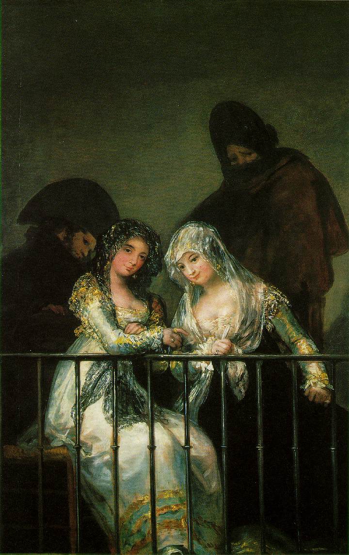
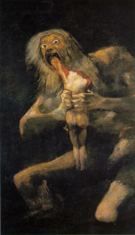

Okay, so the connection here isn't so remarkable. Still, in both the cat and the Goya, the subdued figure in the background is the decisive feature, reversing the mood of the image. Goya's portrait of two court ladies is initially pleasant and distinguished; the image of the cat is initially cute. In both cases, the repose of the foreground is disrupted by the sinister figure lurking in the background. Why are they there? What are they planning? Why aren't they letting me enjoy the pretty ladies and/or cute kitty?
What does it mean that such remarkable parallels exist between fine art and sugar-coated amusement? Maybe it means the appeal of images is universal, whether they're exalted as fine art or dismissed as tongue-in-cheek irony. Maybe the shape and structure of an effective visual is the same in every case, from masterworks of portraiture to advertising photography to cute kitty snapshots.
Or maybe it doesn't mean anything. Maybe I just like pictures.
Friday, November 03, 2006
An aesthetic reflection prompted by an interactive design by Jonathan Yuen
Jonathan Yuen has created a brilliant online piece. My first reaction is just to appreciate the simplicity and intensity of the images, and to be impressed by their relationships... they have texture and depth, but they're sharp and recognizable. There's a line that connects them, starting as the contour of the bank in the first images and then becoming the silhouette of the ground in the other ones. Each one is accompanied by a few characters, and when they're rolled over, they reveal a statement from the artist. The visuals harness a few essential design skills, including balance, continuity, recognizability, chromatic consistency, and control of the focal point.
When I see a piece of work like this, I start to wonder where the basic substance comes from. Jonathan Yuen describes himself as a "multi-disciplinary designer," and he uses a lot of fiercely controlled techniques... aside from the label itself, this is what could mark this piece as a work of design. Fine art tends to evoke terms like "expression," and in this piece, this is tempered by a suggestion of "communication"... the recognizable figures, the calculated movement and color scheme (red for rollover), and the non-English characters as an enigma for the English-speaking viewer are all devices perfected in the world of marketing and corporate identity.
There's the other side, though. This is a profoundly autonomous piece of work, and the expression, or externalization, of the SELF is a classic fine art endeavor. A close friend once said the following with regard to any act of creation: the product (or productive activity) is art to the degree that it is totally autonomous, and it's design to the degree that it's done for an audience. This is a good starting point for these terms, but this answer is only necessary because we can't seem to get away from the question of art versus design.
Or maybe it's just that I can't get away from it. In any case, whenever I try to bring up the question of "design versus art" (and it's a played-out question, I must admit), I feel like I'm beating a dead horse's decomposing corpse. So why do I feel like it's still unresolved? Maybe it's my innate, futile need for strictly-defined semantic distinctions. Maybe it's self-serving... maybe I'm trying to see "design" as the alien element, so that I can incorporate it into my "art" and see myself as an innovator.
There are a lot of issues here, though. For instance, there's the "self/other" split. Is each individual his own observer, the little man in the back of the brain looking out for its own soul and identity? If so, then all productive activity in the world is essentially art, because in the end, even if it's through other people, each person is only trying to impress herself. The alternative is that we can only see ourselves reflected in others' perceptions of us (a classic psychoanalytical and feminist idea), so we're always creating things for an audience, even if we delude ourselves into thinking we're just doing it from deep in our own souls. If this is true, then according to the above definition, all productive activity is design, even if we try to claim it as pure and independent.
There's one more thing I want to throw out: maybe the competition paradigm in Western society has made it impossible to resolve the art vs. design dichotomy that seems to affect us creative types. We can focus on the individual's agency (self, "art") or we can focus on our relationship to the people around us (the market, the audience), but we think in capitalist terms, like "fair competition," "economic survival of the fittest," and "productivity as value." This puts a wall between the individual and the outside world that the individual agent simply can't break through. Capitalism has precluded us from seeing "for ourselves" and "for our audience" as the same thing.
If anybody seems close, though, it's Jonathan Yuen. His piece is straightforward, expressive, and communicative. It combines palatability, the strength of tradional design, with richness, one of the things that makes art so important to so many people. It's an aesthetically-crafted package of self-expression, a very personal space for the author, fashioned in a way that welcomes me into it. I like this kind of art.
Subscribe to:
Posts (Atom)