Here was the YouTube what-the-f'ck moment of the season... maybe the year: Kosmo Kramer goes racially ballistic. I'm sure you've all heard about this. I hope you've seen it, too. Actually watching it is a different from the second-hand experience. It's surreal and disturbing, like some sort of celebrity Real World meets Aronofsky shit.
It's ridiculous and unpredictable, but believe it or not, things can get weirder. After all, we can just write Michael Richards' outburst off as another insane celebrity, like Tom Cruise the Scientologist, or Mel Gibson the raving weirdo. But a few days later, Richards went on Letterman to apologize, and that's when it gets REALLY hard to process.
The guy on Letterman isn't a PR afficianado, nor a racist creep, nor a short-spoken apologist making a last grasp at credibility. He looks like a man on the verge of a complete breakdown. He absolutely can't explain the person on stage yelling "Nigga" (as it's spelled in the video subtitle)... he doesn't even seem to know who that guy is. Michael Richards claims he's not a racist, and he thanks the country for confronting him... he claims that he has to confront himself (and, to be more specific, to "do personal work")... he says he doesn't even know where that rage came from. He apologizes to people of all races, knowing that he hasn't just offended a few black activists. He's not even sure he should be on Letterman, because he's afraid he won't come across right.
He also says this: "Yeah, I tried to... I tried to do that [diffuse his own remarks by making them outrageous]. You don't have the whole thing there in what they're showing, everyone. I tried to jujitsu that..."
This, my friends, though subtle, is important. I actually tried to find an extended clip, so I could see the part of the routine leading up to the outburst. It's nowhere to be found, and I think it might have an effect on how the situation is interpreted. After all, what we're seeing is overt racism, angry, directed at an uncooperative audience member. It's the kind of violent racism that's been phased almost entirely out of popular culture. But when you take a clip like this out of context, you lose what a friend wisely referred to as "meta-messages."
In light of our culture's approach to racial and identity issues, meta-messages are hard to navigate these days. Dave Chapelle's show was clearly a satire on racial relations, a series of parodic stereotypes offered up by a black man that functioned as a comment on his own culture's self-perception. Compare this with Carlos Mencia, whose humor has taken some flack for being offensive without being funny. Or with South Park's questionable use of stereotypes in character casting. Or to Abercrombie's ill-advised Asian stereotype t-shirts.
Some of these examples make their meta-messages work: Dave Chapelle is clearly using assimilation and self-parody to frame his offensive remarks, and this is an accepted way to drain the power of out a stereotype (just ask the "queer" community). South Park employs a healthy dose of irony... Token's status as "sole black character" is obviously ironic, and it becomes a statement on racial identity when you realize that Token's parents are some of the wealthiest parents in South Park.
Other meta-messages don't work. Mencia tries to frame his offensive remarks in serious treatments of national issues, but he doesn't bring any complexity to the jokes he's making. At best, his rants about national identity are just fluff for his racial stereotypes, and at worst, he actually makes his stereotypes sound sincere and his explanations sound ironic. Not the best idea ever. Abercrombie also failed to make any constructive statement with their racially-motivated humor... with no nod or wink, the race became the punchline, rather than the stupidity of the stereotype, and that's why we call it "racism" rather than "irony."
Michael Richards lost his meta-message, too, and that's the danger of being a comedian in a racially volatile country. Was he building up to his offensive remarks? Maybe, but clearly the crowd got pissed, so they didn't get that, or they didn't care. Maybe he just stepped over a comedic line, to the point where the irony no longer justified the joke.
Or maybe it wasn't a problem with communication... maybe Kramer lost the meta-message in his own head. Maybe that's why he seems so shaken on Letterman, and why he has to confront himself. As a comedian, he's spent years learning to manipulate subtexts and meta-messages, and as an actor, he's spent years creating characters and manufacturing personalities. It seems like, for a moment, he forgot how to frame his thoughts in a protective barrier of self-mockery and sarcasm. Suddenly, the irreverent white boy became a volatile racist, and it scared him as much as it scared us.
"I'm a performer. I push the envelope."
I'm sorry you lost yourself, Michael Richards, but do yourself a favor and get that personal development taken care of.
Tuesday, November 21, 2006
Friday, November 17, 2006
The subtle art of Witty Kitty Photoshop Captioning in the context of modernist painting
Okay, so this is going to be a journey into one of my darker secrets, but I can't help but post on it. But before that, I want to say sorry I haven't been posting much... school and work are converging in an unholy aggregate to swallow my life till about Christmas. It's okay, I like it that way, but still... doesn't leave much time for free thinking.
So through a site I must confess I visit a lot... CuteOverload... I came upon another site. I won't be visiting it as much, but I've sent it to a LOT of people, and I find myself thinking about it perhaps more than it warrants. It's at www.knitemare.org/cats, and it has a lot of well-captioned photos of kitties (some with obvious Photoshopping). First, I just liked the funny references and the amazing photos of cats, and I liked picking out my favorites (among them: Superman, Invisible Bike, Hugs Tiem, and I made you a cookie). But after a while, I started making connections.
 It was the Aggressive Cat versus Defensive Cat shot that did it. It felt disturbingly familiar, and after a while I started remembering a paper I did in college about an American Realist painting. This painting is by George Bellows. The picture shown here compares the Bellows painting to the cat photo. Marvel at the similarities.
It's not just because it's two cats fighting. On one side, you have the dark kitty, clearly dominating, and on the other side you have the light kitty, looking like it's about to collapse under the pressure. Both images have a lot of movement from aggressive to defensive, and in both cases the aggressive party seems to be overwhelming the defensive one, folding over it from above. They're too similar to ignore.
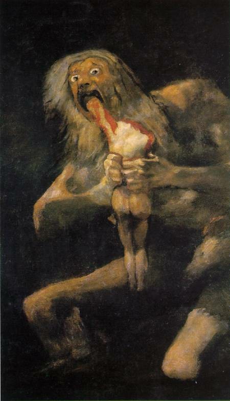
 So after I found that little gem, I went looking for another couple fine-art/cat-art juxtapositions. I only found one more, and I made a juxtaposition of this one, too. It's a comparison of the "Rape is Imminent" photo (which has since been removed, for obvious reasons) with a painting attributed to Goya. This painting isn't universally accepted as genuine, but it's still associated with Goya's body of work. Besides his disturbing images of Saturn and The Colossus, Goya was commissioned to do a lot of portraits of women from court, and this painting is a little bit of a riff on this project.
Okay, so the connection here isn't so remarkable. Still, in both the cat and the Goya, the subdued figure in the background is the decisive feature, reversing the mood of the image. Goya's portrait of two court ladies is initially pleasant and distinguished; the image of the cat is initially cute. In both cases, the repose of the foreground is disrupted by the sinister figure lurking in the background. Why are they there? What are they planning? Why aren't they letting me enjoy the pretty ladies and/or cute kitty?
What does it mean that such remarkable parallels exist between fine art and sugar-coated amusement? Maybe it means the appeal of images is universal, whether they're exalted as fine art or dismissed as tongue-in-cheek irony. Maybe the shape and structure of an effective visual is the same in every case, from masterworks of portraiture to advertising photography to cute kitty snapshots.
Or maybe it doesn't mean anything. Maybe I just like pictures.
So through a site I must confess I visit a lot... CuteOverload... I came upon another site. I won't be visiting it as much, but I've sent it to a LOT of people, and I find myself thinking about it perhaps more than it warrants. It's at www.knitemare.org/cats, and it has a lot of well-captioned photos of kitties (some with obvious Photoshopping). First, I just liked the funny references and the amazing photos of cats, and I liked picking out my favorites (among them: Superman, Invisible Bike, Hugs Tiem, and I made you a cookie). But after a while, I started making connections.
 It was the Aggressive Cat versus Defensive Cat shot that did it. It felt disturbingly familiar, and after a while I started remembering a paper I did in college about an American Realist painting. This painting is by George Bellows. The picture shown here compares the Bellows painting to the cat photo. Marvel at the similarities.
It's not just because it's two cats fighting. On one side, you have the dark kitty, clearly dominating, and on the other side you have the light kitty, looking like it's about to collapse under the pressure. Both images have a lot of movement from aggressive to defensive, and in both cases the aggressive party seems to be overwhelming the defensive one, folding over it from above. They're too similar to ignore.
 So after I found that little gem, I went looking for another couple fine-art/cat-art juxtapositions. I only found one more, and I made a juxtaposition of this one, too. It's a comparison of the "Rape is Imminent" photo (which has since been removed, for obvious reasons) with a painting attributed to Goya. This painting isn't universally accepted as genuine, but it's still associated with Goya's body of work. Besides his disturbing images of Saturn and The Colossus, Goya was commissioned to do a lot of portraits of women from court, and this painting is a little bit of a riff on this project.
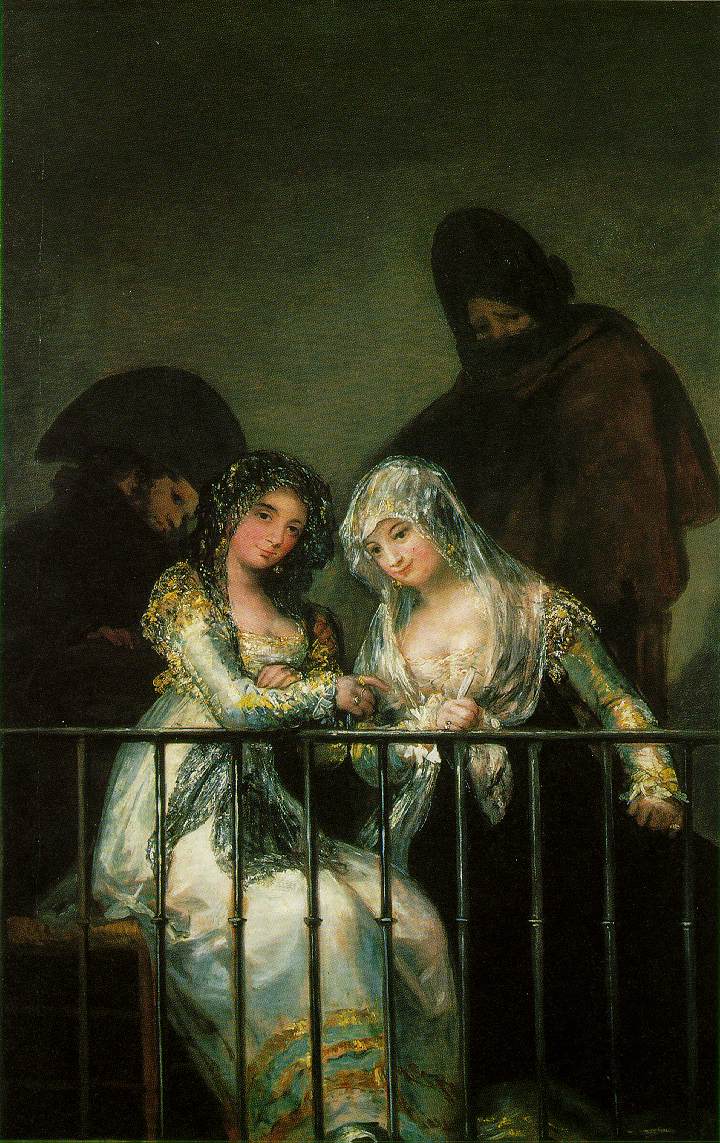
Okay, so the connection here isn't so remarkable. Still, in both the cat and the Goya, the subdued figure in the background is the decisive feature, reversing the mood of the image. Goya's portrait of two court ladies is initially pleasant and distinguished; the image of the cat is initially cute. In both cases, the repose of the foreground is disrupted by the sinister figure lurking in the background. Why are they there? What are they planning? Why aren't they letting me enjoy the pretty ladies and/or cute kitty?
What does it mean that such remarkable parallels exist between fine art and sugar-coated amusement? Maybe it means the appeal of images is universal, whether they're exalted as fine art or dismissed as tongue-in-cheek irony. Maybe the shape and structure of an effective visual is the same in every case, from masterworks of portraiture to advertising photography to cute kitty snapshots.
Or maybe it doesn't mean anything. Maybe I just like pictures.
Friday, November 03, 2006
An aesthetic reflection prompted by an interactive design by Jonathan Yuen
Jonathan Yuen has created a brilliant online piece. My first reaction is just to appreciate the simplicity and intensity of the images, and to be impressed by their relationships... they have texture and depth, but they're sharp and recognizable. There's a line that connects them, starting as the contour of the bank in the first images and then becoming the silhouette of the ground in the other ones. Each one is accompanied by a few characters, and when they're rolled over, they reveal a statement from the artist. The visuals harness a few essential design skills, including balance, continuity, recognizability, chromatic consistency, and control of the focal point.
When I see a piece of work like this, I start to wonder where the basic substance comes from. Jonathan Yuen describes himself as a "multi-disciplinary designer," and he uses a lot of fiercely controlled techniques... aside from the label itself, this is what could mark this piece as a work of design. Fine art tends to evoke terms like "expression," and in this piece, this is tempered by a suggestion of "communication"... the recognizable figures, the calculated movement and color scheme (red for rollover), and the non-English characters as an enigma for the English-speaking viewer are all devices perfected in the world of marketing and corporate identity.
There's the other side, though. This is a profoundly autonomous piece of work, and the expression, or externalization, of the SELF is a classic fine art endeavor. A close friend once said the following with regard to any act of creation: the product (or productive activity) is art to the degree that it is totally autonomous, and it's design to the degree that it's done for an audience. This is a good starting point for these terms, but this answer is only necessary because we can't seem to get away from the question of art versus design.
Or maybe it's just that I can't get away from it. In any case, whenever I try to bring up the question of "design versus art" (and it's a played-out question, I must admit), I feel like I'm beating a dead horse's decomposing corpse. So why do I feel like it's still unresolved? Maybe it's my innate, futile need for strictly-defined semantic distinctions. Maybe it's self-serving... maybe I'm trying to see "design" as the alien element, so that I can incorporate it into my "art" and see myself as an innovator.
There are a lot of issues here, though. For instance, there's the "self/other" split. Is each individual his own observer, the little man in the back of the brain looking out for its own soul and identity? If so, then all productive activity in the world is essentially art, because in the end, even if it's through other people, each person is only trying to impress herself. The alternative is that we can only see ourselves reflected in others' perceptions of us (a classic psychoanalytical and feminist idea), so we're always creating things for an audience, even if we delude ourselves into thinking we're just doing it from deep in our own souls. If this is true, then according to the above definition, all productive activity is design, even if we try to claim it as pure and independent.
There's one more thing I want to throw out: maybe the competition paradigm in Western society has made it impossible to resolve the art vs. design dichotomy that seems to affect us creative types. We can focus on the individual's agency (self, "art") or we can focus on our relationship to the people around us (the market, the audience), but we think in capitalist terms, like "fair competition," "economic survival of the fittest," and "productivity as value." This puts a wall between the individual and the outside world that the individual agent simply can't break through. Capitalism has precluded us from seeing "for ourselves" and "for our audience" as the same thing.
If anybody seems close, though, it's Jonathan Yuen. His piece is straightforward, expressive, and communicative. It combines palatability, the strength of tradional design, with richness, one of the things that makes art so important to so many people. It's an aesthetically-crafted package of self-expression, a very personal space for the author, fashioned in a way that welcomes me into it. I like this kind of art.
Subscribe to:
Posts (Atom)