Tuesday, March 30, 2010

Chromatic March Wrap-Up

The end of Chromatic March was not the best time for me to discover Martin Scorsese's list of "The Best Uses of Color in Film, Ever, Both Foreign and Domestic." If I had discovered it earlier, I might have tried to check them all off. I might have seen Duel in the Sun instead of Mon Oncle, or Cries and Whispers instead of The Umbrellas of Cherbourg. I might have missed The Color of Pomegranates, or skipped the only contemporary film I saw, Burton's Alice in Wonderland. I might have gotten to see Invaders from Mars.

Or maybe it's a good thing, I guess. I saw a couple off there -- The River, The Red Shoes (his two favorites), and I'd seen some before: In The Mood for Love (I'm a Wong Kar Wai fan), The Searchers, and Singin in the Rain. It turns out I also would have missed some amazing stuff: Dario Argento's Suspiria, an operatic horror opus... and the desert fever tones of Ashes of Time, with its hallucinogenic woven narrative and its confessional landscapes.

The general consensus seems to be that color was used best back when it was still a new thing to the cinema, in the days when Technicolor was the ruling power. In those days, stylization was achieved in-camera, as part of the set and costumes. This seems to have changed: now, color seems to be largely a product of post-production, as with Ashes of Time and Alice in Wonderland. It's so easy to take control of color on a computer now, and the hand of the director can mess with so many more dimensions of the experience.

This says something about the changing nature of film. As these classic color movies have shown, dramatic stylization can be achieved even without the intervention of digital coloring software, and in many cases, these production-level palette choices are more complex, more subtle, and more interesting than the highly controlled post-production of contemporary stylists. However, it's also less predictable, and this is the name of the game: digital effects give the filmmaker more opportunities for intervention, and a higher degree of control over a finer grain of detail. Ashes of Time is an excellent example of a tightly-controlled chromatic experience. As some DVD comparisons show, there's a dramatic difference between various cuts of the film, and it's clear that these changes have been made in order to control the harsh chromatic contrasts of the film's Jianghu.

Suspiria stands out among the films of the month. The later films use digital modeling and correction to introduce color choices; the earlier ones generally use objects, clothes, and colors on sets. However, Suspiria almost exclusively used light... the whole film appeared to be lit with colored bulbs, creating dramatic, unnatural gradients between red and blue. It was also one of the only films to attempt narrative continuity, but to abandon chromatic continuity: the same set, in the same scene, could be lit in red, and then cut to being lit in blue, snapping us from hysteria to paranoia and back.

This is a more subtle form of experimentation than, for instance, the bizarre non-narrative world-creation of The Color of Pomegranates. Parajanov used color as one symbolic artifact in a movie made almost entirely of artifacts: carpets, lace, knives, chickens, lambs, and people acting out roles with a cultural and psychic significance, performing a ballet in a barely-comprehensible visual language. In an unhinged film, the colors seemed like the most orderly aspect, performing their well-defined roles: red for the body, black and white for life and death. They provided the groundwork for what was essentially a visual and intuitive experience, and if you worked too hard to force it into narrative logic, it probably frustrated the crap out of you.

In general, though, it was the 50's masterpieces that were the gems of this month of films: The Umbrellas of Cherbourg, The Red Shoes, and The River. These films point to a time when stylization and plot were balanced carefully, never drawing undue attention, and when sequences of events could move along with a mysterious honesty and self-evidence: without the scripted and telegraphed twists and turns of modern Hollywood, or its indulgent didacticism; and without the well-trod self-awareness and forced eccentricity of art cinema, which is creating its own consciousness of culture, but which seems to be losing touch with the human condition. This is probably hyperbole, but it's worth a moment of pause.

Here's what I've written up this month, each film accompanied by the title I've given its palette:

Shutter Island - Overcast / Lurid
Umbrellas of Cherbourg - Ebullient
Alice in Wonderland - Acrid
Suspiria - Delirious
Mon Oncle - Plastique / Provincial
Ashes of Time Redux - Alkaline
The Red Shoes - Portentous
The Color of Pomegranates - Wounded
The River - Enamorous

Hope you've enjoyed Chromatic March as much as I have. Don't worry, I have another theme for next month... check in after a couple days, and I'll get started on it.

Monday, March 29, 2010

Chromatic March: The River (1951)

The River: A coming-of-age tale by Jean Renoir, renowned French director of Rules of the Game and Grand Illusion, that moves through its paces without providing the cliches of redemption that plague this archetypal plot. The River is about the beauty and naivety of childhood dreams of romance, the quiet frustration of being stuck on the outside of a culture, and the need to allow life to continue, even when it seems unbearable. It's a brightly-lit movie of mid-day India, photographed in the shameless colors of youth: on the background of browns and greens, earth and vegetation, it's a vision of reds, oranges, and blues, a culture expressing itself to the eyes of a child.

Renoir's setup is simple enough to be effortless, and yet multifaceted enough to be emotionally complex and pluralistic. A little girl named Harriet, an older child in a family of girls living in a British household in India, receives news of the arrival of a soldier named Captain John. Naturally, the family of young girls is smitten with him, and Harriet almost immediately recognizes Valerie, her slightly older cousin, as a romantic rival for the veteran. In their adolescent rivalry, their channel for their own sexual awakening, both Harriet and Valerie fail to notice that Captain John is struggling with conflicts of his own: a sense of aimlessness and alienation in the aftermath of war, and a frustrated romantic interest in Melanie, the half-Indian daughter of his host in India.

These issues are not sudden emergent conflicts to be resolved through heroics or revelations. Rather, they are the complications of everyday life, the uncertainties and complexities that only unravel with the patient therapy of time and ritual. That's what Renoir's film is ultimately about: man's ability to accept life's challenges, and in accepting them, to let them gradually resolve themselves. Even the most dramatic moments of the film -- a first kiss and an unexpected death -- don't seem to change the characters' worlds, though they do prompt some drastic reactions.

There are lots of stories about the inspiration for The River, mostly focusing on Renoir's collaboration with Rumer Godden, the author of the source novel. Only a few mention the paintings of Jean Renoir's father, noted Impressionist Pierre-Auguste Renoir, but some of the father's paintings could be interpreted as direct source images for the film. In particular, consider a painting of a little girl in a garden, holding a hoop, or various images of emerald landscapes, gazed upon by society women in porch chairs. The epicenter of Renoir's film is an echo of these pastoral scenes... his India is a sun-drenched landscape of greens and earth-tones, and the moments he captures resonate with the same sensuality as his father's landscapes and feminine figures.

Upon this lush background, Renoir places a distinctive palette of simple colors: the red chalk dust of a public ceremony, thrown over all who pass through it; the oranges of the Indians' Sari's; the blue of the embodiment of Lord Krishna, in a mythical narration by the main character from a story she wrote in her journal. According to Ian Christie, writing for The Criterion Current, this was largely due to Renoir's awareness of his technology:
Like many filmmakers of this period, shaped by the discipline of black-and-white photography, he was highly conscious of the limitations of three-strip Technicolor, which produced rich, saturated hues. Rather than try to nuance these toward a more subtle palette, Renoir took the view that the filmmaker should set color film only “simple problems.” He thought the tropical vegetation of Bengal ideal, with its “colors neither too vivid nor mixed,” reminding him of the painters Raoul Dufy and Henri Matisse. Renoir and his lighting cameraman (and nephew), Claude Renoir, working with the designer Eugène Lourié, aimed at avoiding all “half-tints,” even going so far as to paint a lawn a more definite shade of green for one scene.
Whatever the director's reasons, these strong colors take on their own particular role in the film. Specifically, they become cultural indicators for the icons of Indian and Hindu tradition... the brightest reds and oranges are the chalk dust, the Indian garb, and the flowers and decorations during the Hindu festivals. Blue, though often present, is only brought into the foreground in the skin of Lord Krishna, who is of a living artifact of this culture. The whole mythological system is seen by the young girls (especially Harriet) as a vibrant mystery that holds the keys to the strangeness of life on the banks of the Ganges. It's a mythology that vibrates in these bright, living colors, contrasting severely with the white, brown, neutral and earth-toned European colonial sanctums that comprise Harriet's own native world.

The River is cited by Martin Scorsese as one of the two greatest uses of color in film, the other being the (recently discussed) film The Red Shoes (see his whole list of great color films here). These two films make interesting sister pieces, at least in terms of aesthetics: as I mentioned before, the most vibrant colors in The Red Shoes are the colors of darkness, the shadowy interiors of hallways and backstage hiding places. It's a subtle palette, wherein even the signature color, the red of the titular ballet shoes, is generally immersed in shadow. This contrasts sharply with the color treatment of The River, which is a day-lit film about sunlight and vibrant exterior space. As Ebert said in his Great Movies essay, "Although the film covers one year, the impression is of an endless summer day during which the girls play and write in their journals". It's a movie full of splashes of bright color, representing the products of a vibrant culture and religion. Interior versus exterior, shadows versus sunlight, subtlety and nuance versus simplicity and distinction: these are two lessons in visualization, two opposing chromatic worlds, rendered at the genesis of widespread color cinema.

Ultimately, though, this use of Technicolor is only the technical and artistic touch upon a subtle, delicately-wrought poetic narrative. It's a film that resists many pitfalls of such sensitive material: cultural paternalism, cliches of exoticism, moralization about its characters' behavior, or the easy solace of resolution to the myriad challenges it offers to the viewer. Like the river of its title, the film flows into its own horizon, willing to redeem itself through repetition and recreation of the conditions of its own existence.

Palette: Enamorous

Enamorous_River

Wednesday, March 24, 2010

Chromatic March: The Color of Pomegranates (1968) discussion

Sayat Nova (aka The Color of Pomegranates): one of the most challenging movies I've seen in the entirety of my mission to see interesting movies, up there with Fata Morgana, Sans Soleil, and The Holy Mountain. The composition and orientation of scenes, the choreography of action, and the rhythm of events all fly in the face of my accepted viewing habits, and in order to appreciate this ostensible masterpiece by maverick Soviet director Sergei Parajanov, I had to take a deep breath and fully buy into it. It took a lot of patience, and an effort to thoroughly relax my brain and accept my intuitive reactions without question. Aside from those instinctive, aesthetic, and subliminal reactions, there's not much to work from when trying to create meaning from Parajanov's disparate images.
Commentators like talking about two things with The Color of Pomegranates: first, Parajanov's arrest and imprisonment in a Gulag for his Armenian nationalism; second, the subversive aesthetics of the film's images. For instance, you'll frequently hear the film referred to as "poetic," generally as a way to explain its non-narrative, often impenetrable treatment of its subject. Second, because of his strange, motionless use of his camera, and his tendency to have all his actors address it directly, Parajanov's images are commonly referred to as "tableau," and critics make observations that he seems less like a filmmaker and more like a folk painter in motion. If you think of these in that light, then this whole film is sort of a tapestry of small stories, each represented in a static scene. This is sort of fitting, considering Armenian woven carpets and religious tapestries are one of the foremost motifs in The Color of Pomegranates.

The Color of Pomegranates is known for its effective use of color; indeed, this is what led me to it, here in the middle of Chromatic March. The film actually has a gestalt structure of color consciousness, I think... the background palette is arid and earth-toned, light brown and gray, the color of dry desert ground in oversaturated sunlight. This sets the dusty exterior tone for the whole film; indeed, even interior sequences seem to be infused with open air and penetrating sunlight. As we've read before, Technicolor required a lot of light to work right... but Parajanov's lighting is intense, a reminder that we're out in a bright, dry world, exposed to its elements.

This desert palette provides the ground for the second palette in The Color of Pomegranates, which is basically black, white, and dark red, with a touch of pastel blue-green in one key sequence. This palette is used to separate objects from the background: the white of lace and a desert rose, the black of the monks' robes, and the crimson of pomegranates, rugs, dye, and animal blood. Of course, I can't give you a simple reading of these foreground objects that seem to take on such intense significance. In order to do that, I would have to construct correspondences for the whole movie, which is a massive agglomeration of such symbols, all of which seem to be speaking a foreign visual dialect.

So, to return to an earlier point: is this visual dialect truly "poetic"? The descriptor comes up too often to ignore. Is there some similarity between the way a poem speaks in words, and Sayat Nova speaks in images? Well, from a quick survey of dictionary.com, I find that most of the definitions define poetry as written work using heightened language, and/or words chosen for their sound, and/or using certain formal devices, such as "meter, metaphor, and rhyme." It's fairly safe, I think, to say that poetry is expressive writing that prioritizes formal aspects over natural language use, and expression over communication.

And in a sense, this does describe The Color of Pomegranates. Formally, it's a deeply experimental work, deconstructing the "language" of cinema and reinventing it in an eclectic painterly style. In terms of content, it eschews the traditional means of telling a story through recreation of a hypothetical reality... instead, it collects references and symbols and motifs, and it assembles them into a constellation of concepts gravitating around the character of Sayat Nova, accompanied by his muse, his parents, the monks of his monastery, and others who passed through his life.

Before and during my viewings of this film, I glanced around the web for some guidance in watching it. I found very little... most of the sources merely expressed their appreciation, and repeated their first and second impressions of the film: it was poetic, emotional, subversive and meditative. It has great use of color. I'm a guy who needs to find some conceptual anchor points, especially in an obviously complex, highly semantic film like Sayat Nova, and these sources generally weren't helpful.

So I'm going to try to take a step and give you a starting point for forming some interpretations of the elements in Sayat Nova. These are just tentative observations, but if you're about to watch this mysterious, beautiful film, they may at least give you an idea of what to look for.

1. The simplest thing to note: the film has a bit of chronology to it, and if you're clued in ahead of time, you won't have to work so hard to figure this part out. It's roughly divided into four periods: childhood, when the protagonist is played by a child; adolescence, when he is played by a young man; adulthood, when he is played by a tall man with a goatee; and late adulthood, when the same grown man appears, but with a streak of white.

2. The Pomegranate and the color red: the pomegranate and the splashes of red, especially in the rugs and the animal sacrifices, seem to represent the body. This becomes a spiritual focal point at a number of moments in the film... for instance, the implied birth at the beginning, with a trio of whole pomegranates and a knife. Could this symbol reappear at the end? Hmm...

3. Armenian culture is famous for, among other things, two textiles: carpets, and lace. The former figures prominently into the young life of our protagonist, and if we're to read the film's primary female figure as his muse, then the second is a motif associated with her. Wool and lace, love and desire -- these themes are constantly at the forefront of the film's imagery.

4. Note the use of white garments and face paint, which has a pretty clear representational role.

5. A bunch of other motifs that will be repeated, and that form the texture of Sayat Nova's symbolic vocabulary: the books, a golden shell, cherubs, water spilling from the earth, the flock of sheep (which, at one point, act as a congregation witnessing the death of a spiritual leader), a pair of fools, the troubadour's lyre, and skin turned red, either with dye or with blood.

6. Watch for three of the most beautiful moments in film: first, on a rooftop, surrounded by books drying in the sun; second, in the Land of the Dead, before a cadaver in a storm of ashes; third, toward the end, when the protagonist's voice is preserved in a clay vessel.

You may not need to do any active interpretation of The Color of Pomegranates. Many (perhaps most) of its advocates love it purely for the visuals, and for the mystery and atmosphere of the experience. It's absolutely a beautiful film in this regard, and so if this is true of you, I applaud you. If you're not this type of person... if you need a semantic foothold before you can maintain interest in a film... then I hope my list above gives you what you need to enjoy it. It may be a masterpiece, but going out on a limb, I'd say it's definitely not for everybody. But if you've got an open mind and a curious, patient soul, I'd recommend giving it a look.

Palette: Wounded

Arid_Wound

Friday, March 19, 2010

Chromatic March: The Red Shoes (1948) analysis

The Red Shoes: a dark, classical, and enigmatic 1948 movie about a bunch of different stuff (as all good movies are), but mostly ballet. It's an adapted fairy tale, but it feels more like the balanced, sweeping composition that ballet and stagecraft imply. The core story is about a rising ballet star who is recruited by a great director for his company. She meets another talented recruit, the director's new composer, and in the midst of growing recognition, they fall in love. The director, a ruthless devotee of his art, resents and opposes the happiness they've found together, which conflicts with his puritan ideas about the purity of an artist's lifestyle. His resentment brings about a heartbreaking conflict between human love and devotion to an artistic pursuit. The acting is brilliant, the experimentation is heartfelt and effective, and judged as a traditional narrative piece, it stands with the best films I've seen.

The three leads in The Red Shoes play to a perfect pitch, each exhibiting that charisma and alluring distinctiveness that old Hollywood was so good at creating. Victoria Page, the rising ballerina, is radiant and captivating... before being chosen for the part, she was indeed an accomplished ballerina, and so she reinforces the film's commitment to the art it showcases. Julian Craster is a young idealist swept up in the early stages of success, and whether he's testing out a new composition at the piano or professing his love for Victoria, he follows each of his passions with fetching sincerity. However, it's Boris Lermontov, the daunting director of the company, who provides the core character of the film. He is a manipulative totalitarian, obsessed with success and purity in his art, but his presence is also one of incredible charisma. He is ruthless, but never quite evil, because in his private moments, we can see that he is sincere about his love for ballet, and when circumstances conflict with this ambition, it visibly tortures him. Ebert is correct when he identifies Lermontov as a centerpiece of the film's mysteries:
The motives of the ballerina and her lover are transparent. But the impresario defies analysis. In his dark eyes we read a fierce resentment. No, it is not jealousy, at least not romantic jealousy. Nothing as simple as that.
In Lermontov, actor Anton Walbrook provides directors Powell and Pressburger with an unfathomable antagonist.

The Red Shoes, like many more recent (more stylized) films, employs the device of using red objects (the shoes especially) to create small focal points of attention. However, it's far from a one-note production. In fact, the colors in The Red Shoes provide the starting point for engaging with the deeper themes and subtexts of the film. It's a film about ballet and high society, a romance based on a fairy tale, but this belies the darkness and disquiet that lurks below its aesthetic surface. In The Red Shoes, those festive, high-spirited scenes on the stage and in the theater are just a veneer over a movie full of resentment, frustration, and uncertainty.

Likewise, those well-lit interior scenes, whose warm yellow plaster is offset by the colorful stage objects scattered about... those scenes are common, but they aren't the scenes that really set the film's tone. The scenes that really establish the tone are the ones in unlit hallways and dark bedrooms, private spaces lit by candlelight... the shadows cast over a dimly-lit stage, a single spotlight in a dark chamber in the depths of consciousness. It's rare that you see this many colors of darkness, sometimes all in the same scene: a yellow wall in the glow of a candle flame, a gradient from blue to gray or pale red to dark green. In some movies (Suspiria, for instance... I love using this movie as a comparison) the darkness is invaded by color from outside. However, it's rare to see an effect like the one in The Red Shoes, where the colors seem to be emanating from the darkness itself, filling empty spaces and inhabiting volumes that should be completely invisible.

Of course, blues and greens aren't the only colors. The Red Shoes would get a bit bland if it was just red shoes and dark hues... this miasmic shadow is broken up by the occasional beautifully-lit practice stage or sunlit parlor. These gilded scenes are astoundingly romantic and reassuring, but they're also artificial and transient, like a spotlight encroaching just for a moment on the infinite shadow of an empty stage. They ultimately serve to remind us of their own flattering, gilded impermanence. The darkness is where all the substance of the film resides, alluring and foreboding and unpredictable.

Director Michael Powell, working here with frequent collaborator Emeric Pressburger, ventured further into these dark spaces with later characters, like the infamous Mark from Peeping Tom. Peeping Tom was Powell's infamous failure, a complex and intelligent horror movie that was too controversial for the audience at the time. In it, Powell further pursued his theme of dark spaces and landscapes of the mind, showcasing the rainy streets of London and the unlit apartment of its disturbed central character. He also had a scene in a theater, with Mark victimizing a flirtatious actress, and the sinister sets and stages of The Red Shoes seem to anticipate this scene, in a way. In these two films, arguably Powell's best work, he explores theme of theater as a psychological stage, a place where we're able to play out our deviant fantasies, put them on display, and ultimately bear witness to them ourselves.

This film is a reconstruction of a Hans Christian Andersen fairy tale of the same title, a story that then plays a prominent part within the film itself. Interestingly, some of the anxiety in The Red Shoes may come from Hans Christan Andersen himself. According to some notable news stories and reviews1, Andersen was a failed dancer, and feet and shoes figure prominently into some of his stories as aversive fetishes. The imprint of his failures, his fears, and his personality upon his story, then upon the ballet based on that story, and then upon this film, derived from that source material, would be a great topic for some obtuse postmodern theory.

The Red Shoes comes highly recommended, like so many of my Chromatic March films; if you've seen it, let me know what you thought of it, and if you haven't, I highly recommend it.

Palette: Portentous

Portentous:_RedShoes


[1] This "tribute" piece is obnoxiously patronizing and backhanded, by the way. After you read it, please read The Self-Styled Siren's response to it, which I definitely relate to.

Wednesday, March 17, 2010

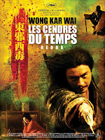
Chromatic March analysis: Ashes of Time Redux (2008)


Ashes of Time: a period drama from Hong Kong’s current it-boy auteur, full of drama and adventure and style and stylization, enigmatic and non-linear, with an ensemble of hyper-cool Hong Kong acting talent. Director Wong Kar Wai has made some beautiful films, including In the Mood for Love, a nostalgic platonic love story with a soft touch; 2046, a retrospective on failed romance; companion films Days of Being Wild and Chungking Express; and his most recent, an American travel saga called My Blueberry Nights, starring Jude Law and Nora Jones. Wai comes from a graphic design background, and his movies are all delirious blurs of city lights, reflections, and slow motion. They’re also famous for their slow, wistful sentimentality and open-ended plot arcs and relationships. Wong Kar Wai revels in the power of the vivid image, and his characters coast quietly and sadly through his stylized worlds.

For a fairly recent movie that flew a bit under critical radar, Ashes of Time has generated a good bit of online discussion and interpretation, largely from the director himself. A fairly comprehensive overview and analysis can be found in the online Press Kit, which may help you sort out the complex and ambiguous plot, if you don’t want to tackle it yourself. Another site has an excerpt from a magazine interview with Wong Kar Wai, wherein he discusses the relationship between Ashes of Time and some of his other work. In particular, he likes to discuss the Jianghu, the imaginary alternate Earth where the classic Wuxia hero stories tend to take place… a world envisioned in the breathy close-ups and epic landscapes of Ashes of Time.

This world – Wong Kar Wai’s Jianghu – is a garish yellow-and-blue universe of empty-space compositions, where a landscape is defined by a horizontal horizon line and a single tree. It's a gilded world, impressing itself aggressively on the senses, and this gives the landscape and its characters an alkaline sensory edge, keenly lucid and immersive. Christopher Doyle's cinematography adds to this effect, focusing our attention on facial expressions, single gestures, and the most minute details of the visible landscape. Even in the close-ups and action sequences, the visuals are dominated by solar yellow, harsh light, and overexposure. The first shot of Ashes in Time Redux, which was apparently added for this re-cut, sets the stage for the sensory mode that Wong Kar Wai establishes. Looking into the sun through dust clouds, we can imagine our eyes burning, and they seem to keep the radiant after-image of that sun for the whole film.

This heightened reality supports a madly complex narrative that follows the interactions of at least seven major characters (I'm counting Feng, Yaoshi, the blind swordsman, Huang, Murong, Feng's lost love, and the girl with the donkey and the eggs). Their stories are entangled in a chronology that's challenging and non-linear, although as far as I can tell, it's not self-contradictory. To make the situation even more complex, many of the characters are connected by parallel themes... the fight with the bandits, the lost love of a woman at home, the desire to remain pure of purpose, the thematic recurrence of blindness and the Peach Blossom. A number of the reviews I read seemed to mix up multiple characters, and without a second or third review, I can understand why.

Wong Kar Wai can fit these complexities in partly because he makes no attempt to capture them on-screen. The general shape of the narrative comes from voiceovers by various characters, and the visuals mainly serve to set the tone for this exposition, and to support it by rendering the emotional content, and filling in details and drama where necessary. The visuals are thus used almost entirely to capture key moments that supply substance to the narrated plot. However, even as this approach allows an abundance of storytelling material, it also serves to obfuscate those stories, to the point where they're almost indecipherable. The first time through the film, you might think those seven characters are as few as three or four, and they may seem to change places in impossible ways. You may actually end up thinking this film is more artsy than it actually is. According to the filmmakers, this is because the Jianghu is a place of moral absolutes and human universals. The ideas driving these characters are more important than the conflicts and personalities of the characters themselves.

And we see this sense of absolutism, this harsh confrontation between light and dark and loyalty and betrayal, in the way the colors infuse the landscape with harshness. This is a world without soft edges, without flexibility or nuance. It's a world where the sky meets the earth at the unbreakable barrier of the horizon.

In the course of the film, three of the heroes are associated with the cardinal directions. These are Feng, the Lord of the West, Yaoshi, the Lord of the East, and Huang, the Beggar King of the North. Nobody seems to represent the South, but I think at least two characters could qualify. These are the two great warriors of the tale who never reach satisfactory conclusions: the Blind Swordsman, and Yin/Yang, the dissociative princess of the Murong warrior clan.

My first choice is the Blind Swordsman, who comes from the South, but never manages to attain the other characters' fame. The Blind Swordsman is killed before he makes it to whatever kingdom awaits him, and his corpse has to speak from the ground to warn Hueng about the left-handed swordsman. The loss of his love, his status as a wandering Ronin of the Jianghu, and his association with his home in the South, where he has left Peach Blossom behind -- these all point to his status as unfulfilled Lord of the South. Of course, it's also possible that Princess Murong represents the South, for she becomes an infamous, enigmatic warrior, and her story after her night with Feng is never told. Like the men of the East, West, and North, Lady Murong pines for a lost love, and this longing ultimately drives her to pursuit of perfection and solitude... whether she earns the Lordship over that final cardinal direction is an open question.

If you're already totally confused, and you're asking, "Did I even see the same movie?", it might be because you're still afflicted with first- or second-viewing syndrome. This is the feeling this film causes that all the characters are all interchangable, and that they somehow exist in an impossible space-time continuum. Honestly, this reaction is acceptable and understandable, because it means you've already engaged Ashes of Time at the first, most important level of understanding. It only takes one attentive viewing to experience the drunken power of the movie... but if you want to untangle it on a narrative level, and appreciate the distinctive beauty of each of the characters' stories, you'll have to watch it at least a few times. I actually did my best to help with this process, by creating an extended timeline of the Jianghu of Ashes of Time.

The timeline (clickable at left) takes all the little details and twists and revelations, dispensed wily nilly throughout the film, and arranges them into an order that allows them all to make sense. There are certainly ambiguities that I've overlooked or made assumptions about, but this is a good starting point. For instance, it's a striking moment when you realize that the whole ordeal with the girl and the horse-bandits... a pair of adventures that make up at least half of the movie... all take place after Yaoshi has taken the wine to forget his past. This final meeting between Feng and Yaoshi is presented early in the movie, but it seems like it happens at the end of the chronology, when it actually happens right in the middle.

Using this pivot-point as a landmark... the death of a lost love and the gift of forgetfulness... I've separated the film into two chronological sections. I call the first half the "Time of Wandering." This is when Yaoshi is making his rounds, visiting Feng and his lost love in turn, bringing them news of one another. During this time, the free-spirited Yaoshi sets the stage for many of the later developments: he steals the blind swordsman's wife, he makes a false offer of marriage to the princess of Clan Murong, and he generally damages and alienates people around him, despite his best intentions.

I call the second half of this chronology the "Time of Fighting and Forgetting". This is a period in which Feng, true to his calling, is cleaning up the complications engendered in the first half of the film. He encounters Mourang as Yaoshi, he provides a final, fatal task to the estranged Blind Swordsman, and he mentors Huang, the Lord of Beggars, who will eventually become his adversary (this destiny is barely mentioned in the film, and it's depicted with no real explanation, but all the foreshadowing is there). During this period, Yaoshi vanishes, losing his memory and eventually retiring to hermitage. This is Feng's time to start creating history.

A beautiful, powerful, complex film, and at this moment, my personal favorite from Wong Kar Wai. The enigmatic structure of Ashes of Time provides a powerful lens for its intensive exploration of loneliness, longing, and uncertainty, and for its experimentation with time and space. Wait to see Ashes of Time until you're ready to really work for it... when you get there, I can assure you, it will be a rewarding experience.

Palette: Alkaline

Alkaline_Ashes

Tuesday, March 16, 2010

Chromatic March: Modernity + Color in Tati's Mon Oncle (1958)

Jacques Tati’s Mon Oncle (1958) had me almost from the very beginning. Some people complain that it’s too long, too simple, too heady for its genre, or lacks a pointed sense of humor, but I was in the right frame of mind to accept its playful tone and easygoing comedy... and I’m pretty sure it was the dogs that put me there. The story of parental and fraternal relationships, the commentary on modernism versus traditionalism, the themes of automation and mechanization and growth – all these were contextualized by those interspersed scenes of stray dogs running through the town. They reminded me at every step: keep your peace of mind, no matter your reaction to this text and your relationship to these ideas. Frustration and argument are stronger forces than urbanism or modernity, and they’re the true enemy of the balanced life. I loved those dogs.

If you want a lighthearted movie filled with careful treatments of big ideas, then Mon Oncle may be for you. All the literature notes its commentary on modernism and the mechanization and detachment of modern life, a scary road we were traveling in the 50’s before the chaos of the 60’s came to our rescue. However, no review or analysis captures the number of minor themes this dialectic encompasses: growth and maturity (embodied in Betty the landlord’s daughter), the disconcerting link between modernization and social status (the fishy fountain in the Arpel front yard), the responsiveness of nature as a parallel to the machines (Mr. Hulot’s activation of a bird on a windowsill for music), the burden of hygiene (borne throughout the film by Mme. Arpel), and the inefficiency of “efficiency” (i.e. loud machines and uncomfortable chairs).

As far as intellectual content, the film’s biggest commitment is to its aesthetic contrast: the contrast between the aforementioned modernist world of efficiency and detachment, and the evolving, organic world of life and play. Tons of literature has been written about this, and I won’t be able to seriously distinguish myself, but at the very least, I can focus the discussion through my current critical theme: color. The confrontation between hyper-modern and charmingly provincial is embodied in almost every aspect of the narrative, and the production design is no exception. It seems to be a war between two color spaces: the French town is sandy brown, spotted with green underbrush and faded paint, the colors of a dry countryside at the mercy of dust and weather. The second color space is the Villa Arpel, set apart by a gray fence, that places an ordered array of artificial colors on a canvas of bleached white concrete and plaster, the flat gallery-space of synthetic materials.

Villa Arpel is a caricature of modernist minimalism, and Tati really invested in getting as close to the subject of his critique as possible. Some authors have observed that the Villa is, in fact, a worthwhile representative of actual modernism, drawing as it does from some very important influences: De Stijl and Mondrian, Josef Mueller-Brockmann, and Jacques Lagrange (less an “influence” than an actual collaborator). The house was recreated in France as an homage both to the period and to the director who critiqued it. Once you notice Mondrian’s influence, it’s hard to see the Villa Arpel in Tati’s film as anything but a big, extended Mondrian painting, with gray and white surfaces, punctuated by objects in highly recognizable colors, made distinct and identifiable by their intense contrast. This is a house you could chart, or organize by color, tailored as it is to visual order… an exercise in formalism and efficiency.

The interior of the Villa Arpel is thoroughly artificial (“neo-plastic,” as the De Stijlers called it), but it also seems to be a loving recreation of the outside world, as evidenced by parallels between the Arpels’ gadgets and the mechanisms of nature. The electric eye that controls the Arpels’ garage is a fascinating device, but we’ve already seen something like it, a bird perched outside Mr. Hulot’s window that seems to be photosensitive: whenever the reflection of the sunlight hits it, it starts to sing, like a solar-powered stereo system. Mr. Hulot turns it on at every opportunity. A cold and unresponsive modern kitchen is a fetish for Mme. Arpel, just as a street vendor is a figure of obsession for the group of boys who Gerard accompanies; turning the food, cooking it, and depositing it is a key function of the cultural architecture, but only the human vendor can be truly responsive to the desires of his customers. In addition, the parallels between the dogs and children might seem compelling, but better and more subtle: the juxtaposition of the stray dogs with the herds of black-and-white automobiles, which traverse the artificial landscape like the dogs travel across the natural one (and like the cars, the dogs always seem to be moving, occasionally pausing at a destination and then continuing on their way).

It’s a rare film that uses bright colors to communicate dull inertia. Tati’s use of primaries is certainly a critique, but it’s a good-natured one – there’s nothing malicious or immoral about the Villa Arpel. Rather, contrasted with the engaging complexity of the outside world, the interior of the Villa seems like it’s made for small children, right down to the primary colors and pressable buttons. The Arpels live in a world made for easy manipulation and simple pleasure, almost patronizing in its blatant plasticity, and they feel that this emotionally-regressive environment provides the most advanced life they can lead. It’s too child-proof even for Gerard, who’s grown up past the age of arranging plastic chairs and turning knobs and pressing buttons. Villa Arpel is a toy universe, and its residents are, in a certain way, a pair of chubby adult babies. If this wasn’t a comedy, it might be a bit tragic.

Maturity, as a human trait, is given only passing attention in Mon Oncle, in the character of Betty Schneider, the landlord’s daughter. Her role is one of the most cryptic in a generally transparent narrative: she starts the movie as a young girl, and in the course of what appears to be a couple months at most, she becomes an adolescent, and then a grown woman. It’s a narrative idiosyncrasy, and yet it fits into the construct, at least in spirit: Betty is another token of Tati’s reverence for human life, caught up in slow changes that seem to happen overnight. In a film populated by children, childlike adults, and artificial playgrounds of amusements, she is an emblem of the real world, where all these things… childhood, uncertainty, employment, wealth, and modernity… are just phases in an endless transition.

Of course, I’ve only grazed the outer shell of Mon Oncle’s conceptual substance, and there’s a lot more I could talk about. However, when I try to cover all these themes, I end up wanting to write a whole book. This is, after all, a robust film for interpretation, playful, often absurd, and interconnected in a deeply organic way. This process of interpretation threatens to undermine the real genius of Mon Oncle: the fact that it’s a fun, easygoing film, and that it would rather entertain you than inform you and eviscerate your cognitive faculties. Remember the dogs.


Palette(s): Plastique / Provincial


Plastique_Tati

Provincial_Tati

Sunday, March 14, 2010

Chromatic March: Eye Candy, by Superfad

Motionographer posted an incredible piece of motion graphics, created by NYC studio Superfad for Sony. Please... view it on Motionographer and be riveted.

According to Motionographer, this is actually broken into three chapters... once you know this, you should be able to pick them out... especially when you know their titles: "Birth of Color," "Explosion of Color," and "Release of Color." I may not have guessed this structure on my own, but now that I know it, it's very clear.

It's worth noting, here, how the colors are placed in a black field (much like they are in Suspiria), which really brings them out. The emptiness of a black space on a monitor (or TV screen) is a powerful factor in digital design that simply doesn't hold so strongly in print. Sure, you'll see people on white backgrounds in TV and film (THX-..., for instance), but it happens a lot less in video than it does in print, where the standard is color (or black) on an empty white page. Paper is bleached white, and gallery walls are painted white, but when visuals are created for film or video, they often use black as their default background color.

This is probably, if anything, an effect of the physical medium itself. In a gallery or on a page, the white background reflects all the available light, so it provides a standard for the rest of the image. Even in neon or tungsten light, if you have a white page, it will take on that tint, so the other colors on the page will at least look reasonably accurate in relation to it. This is the idea in art galleries: the overhead light is as neutral as possible, and the white walls reflect all that light perfectly evenly, so the art has the correct context for its color.

On a video screen, light isn't reflected... it's emitted. Thus, it's more appropriate for the baseline to be black, which is basically a synonym for "emitting no light." After all, any color emitted from a video screen isn't going to change before it reaches the eyes, even if it's going to be mixed somewhat with the environmental light of the surroundings.

And so Sony gives us a white circle in a black space... an explosion of blue and yellow, and burst of purple dust... and finally, in one of the most compelling images of the spot, a beautiful, slow-motion bird revealing yellow and blue under its wings as it flies through the empty space of the black background. After all, Sony wants to show us how perfect its colors are, but also, how perfectly black its blacks.

And so, they've created this killer little spot, probably at great expense, so the colors can become subjects in themselves, living and dying on a palette of nothingness, the empty black of a visual void and a blank screen.

Friday, March 12, 2010

Chromatic March: some extra reading material

If you're interested in a lot more information on early color process in film, read Murray Pomerance's Notes on the Limits of Technicolor in the 2009 issue of Sense of Cinema. He takes us through an interesting history and technical overview of Technicolor, and his account culminates in a discussion of Antonioni's The Red Desert, one of the highest-regarded color films, which I would be including in this month's blogging, except that it's pretty hard to find.

In particular, note Pomerance's description of the hyperreal look that technicolor gives a scene:
Technicolor tended to offer the intensely saturated, yet also slightly unreflective, and thus seductive, colour that we can see in what photographers call “the magic hour,” that period before sunset on a clear day, when every hue is cast with a little red and the contrast between hues appears to heighten, with the effect that objects stand out from one another with augmented crispness and vitality.
Pomerance's comments on Antonioni are also worth reading, especially if you're interested in Italian modernist art-house cinema. I won't be getting around to an Antonioni film this month, but if you want to read about him, just stick with the Pomerance article:
The colour effects we see in Antonioni’s films are often abstract, in the sense that they are meant to approach and transform the viewer without specific practical reference to the objects in which they inhere. An appreciation of Antonioni’s colour films requires that the viewer really let colour work, and this is ultimately a commitment that transcends rationality.
Read what you can on the films and methodologies, and you can't help but sharpen your appreciation for the things you watch.

Chromatic March analysis: Suspiria (1977)

There's a moment in Suspiria where we seem to return to the real world for a moment, yanked out of the menacing colored light of the ballet academy... this is our short journey with Daniel when he quits, and goes to a tavern for a short time, and then takes a late night walk through one of the city plazas. He enters a kind of space that's rare in Suspiria -- a space where a white key light gives definition to Daniel, and his dog, and the empty surroundings of the late night in an old world city. This is the only time in the movie where we attain some stability, and though it's a suspenseful, chilling kind of stability, it might still feel like a relief from those leering red and blue lights within the academy's close quarters. We're exposed in an empty, echoic darkness, cold and disengaged, waiting for death to come. Yet, it's a moment of respite.

This scene contrasts so sharply with the rest of Suspiria that it's almost unbearable. We spend so much of the film in Dario Argento's nightmare geometries, bathed in red and blue light, that we may forget how colors fit together in the real world. Argento's world is a place where intense colors and mental states, discordant music and spatial continuity, all blend together into a fevered dreamscape of the broken mind. It's a strange, unpredictable, desperate piece of filmmaking, intent on frustrating our expectations at the turn of every scene.

It seems that in Suspiria, Argento didn’t care about his audience. He didn’t care about narrative consistency or spatial logic, he didn’t care about twist endings or set-ups for sequels, and he didn’t care to offer us solace or consign us to despair. He didn’t care to wrap every narrative thread into a tidy knot at the end... like, what was the significance of Olga, or of Susie’s uncharacteristic kindness to Pavlo? Why were there maggots in the ceiling, except because of bad meat, or as a way to gross us out for a few minutes? If he's such an advanced filmmaker, why does he inflict bad timing and campy staging on us at every turn? We have to accept these things and absorb them as part of a film where Argento had other things to worry about... his style, his scope, his sense of time and space, and his devious rhythms, accompanied by Goblin's discordant prog.

Argento's films are frequently described with the anachronistic term "grand guignol," which suggests macabre theatricality, the opera of the horrific. The ballet academy is a vast grand guignol set, the sort of place that you might expect to be built out of craft materials for a stage. It never really becomes a building for us, the audience... our understanding of its geometry is twisted and fragmented, revealed in shots of hallways and closed doors and empty rooms. Somewhere there's a great red hallway... somewhere there are a number of dance studios, a locker room, a pool. Some hallway houses a stairway to a dark attic where they store freshly-delivered meat. We have a general idea of the front door and the massive blue entrance-hall, but these are just for guests; everything else is jumbled together behind the walls, displaced and reconfigured, like Danielewski's House of Leaves.

In the absence of orientation and space, easy access and unique landmarks, the ballet academy becomes a psychological space, a dreamscape designed by a nightmare architect. It loses its shape, and so, ultimately, the colors take over -- the reds and blues, our emotional signals, create a resonance for each room. The colors cling to the edges of the landscape, allowing the empty space to drop into pitch black. More than the white light of the courtyard, the red and blue light in the empty space seems to create a void. It's this blackness that threatens to engulf the girls, swallowing Sarah as she searches for the truth... and inviting Suzie to infiltrate it in search of the source of the school's troubles.

Those reds and blues become some of Argento's most powerful tools. Over the course of the film, he turns the reds and blues into puppet strings for our emotional responses, and then he delights in pulling them, left and right, red and blue, forcing us to do a psychological dance. The reds trigger confusion and disorientation, the panic that Pat Hingle feels in the empty bedroom at her friend's apartment... or Sarah's desperation as she stumbles through the hallways of the ballet academy one lonely night. The red wine is the school's instrument to keep Suzie unconscious and bewildered, unable to come to her friend's aid. Red is generally accompanied by the throbbing drone of the Goblin soundtrack, a wave of aural pressure keeping us from concentrating or centering ourselves. The blues, by stark contrast, come to represent moments of unbearable stillness, the periods of lucid anticipation before an encounter in the dark. The bathroom in Pat's friend's house is lit in blue, as is the small, empty storage room where Sarah sinks into the foetal position, waiting for an unknown assailant to unbolt the door. It should be no surprise that the key to the school's conspiracy, a tiny decoration that prompts a moment of profound realization and apprehension, is a blue flower, stuck to a white office wall.

So much of Suspiria is a war between cruel, stripped-down expectancy and stumbling confusion... sometimes two subsequent shots, both within the same sequence, are lit in entirely different colors. Often, the blue on one side blends with the red on the other to create a purple overlap in the middle. Some other colors take on symbolic overtones, as well, like green, which seems to be the color of remote rationality (worn as it is by the local psychologist), or of true darkness, when there's no red or blue to provide even the barest light. Yellows appear, as well, interspersed between the dominant colors, but these don't seem to have much significance... though they accompany some strikingly important events, like Sarah's final moments in a mesh of barbed wire behind the school's storage area.

Reds and blues, the warmth of flesh and the chill of the empty shadows... these are the forces at work, the tectonic plates under the surface of Suspiria's strange narrative. This hematic inner light creates an alternate universe bathed in panic and dread. As the film progresses, these colors go from the sensory effects to hallucinogenic fetishes, the totems of particular states of mind, and they seep insidiously into the physical objects and musical accompaniment of the film. Thus, ballet academy becomes a psychic space, the grand guignol stage for a nightmare of sound and color, choreographed to perfection by Argento's hand.

Palette: Delerious

Delerious_(Suspiria)

Monday, March 08, 2010

Chromatic March: Alice in Wonderland review and discussion

My review of Burton's Alice in Wonderland is up at BlogCritics.

Burton knows how to be colorful. Colorful characters, colorful landscapes, bright, clashing, quirky performances by exaggerated actors and actresses... saturation was the name of the game in this rendition of Carroll's hallucinogenic classic. And though the environment was surprisingly dark and stormy, bathed in the atmospheric ashes of the Wonderland fires, Depp and Carter and their supporting cast still managed to bring out the highlights of a strange and spectacular fantasy world.

Color choices go hand in hand with textures and atmospheric elements. Color almost never exists on its own... it's a disposition of a surface, which is characterized by its roughness and reflectivity. Burton's Alice in Wonderland is inundated in the metallic textures of decadent fabrics, marred by wear and tear and time and grime. Thus, it scans like a cross between a tailor and an armory, tarnished and sooty and shimmering just a little at the edges.

Alice enters this world in an iconic blue dress, and her baby blue, the pastel color of innocence and naivety, immediately engages her in a landscape of chromatic icons. Never mind the minor characters, the silly animal caricatures and the literature cameos... the real players here are Alice, the Hatter, the Red Queen, the White Queen, and Stayne, the knave of hearts. These characters are neatly distinguished by color, with Alice as a bit of an exception. The Hatter is a festive orange and green combination, like we all remember from the movie posters; the White Queen is pure, colorless, crystalline white, almost to the point of being sanitized; the Red Queen is a ruthless, unpredictable, bloody red bobble-head of a character. Stayne is less important than these others, but he is always in black, with that little red eye-patch. He is enforcement, wrought-iron determination, and death.

The war between Red and White is an effective way for Tim Burton to condense the vast Wonderland mythos, which included a Queen of Hearts (Alice's Adventures), a Red Queen, and a White Queen (both in Through the Looking Glass). Though Helena Bonham Carter's character is called the Red Queen, she's clearly actually the Queen of Hearts from Alice's Adventures; so whereas Carroll's two books were each based on a specific parlor-game, Burton's reimagining is actually an unlikely conflict between two different games: on one side, cards, and on the other side, chess. Both games have a "black" component, and in each case, this component is ignored... the sisters are the White and Red, skill and chance, strategy and psychology. They represent a collision of worlds, with Alice and the Hatter and a bunch of talking animals caught in the middle.

By the way, that paragraph was entirely written from Wikipedia cheat-sheets on the books. It's so easy to make yourself sound smart these days.

Anyway, there's something to be said for Burton's treatment of Alice. As she rides to her engagement party, she dons her classic blue-bonnet-style dress that we're so familiar with. This is, if anything, a symbol of her innocence, the childlike nature that she still has leftover from the classic literature (which comes to her in nightly dreams... if I were her parents, I'd be worried). However, during the course of her journey through Wonderland, she takes on a number of different outfits, and a number of different personas. Many of these are custom-made to fit her when she grows and shrinks... as tiny Alice, she wears something billowy and metallic, somehow salvaged from her original blue. However, she also infiltrates the queen's company, and becomes the Queen's "new favorite" (the writing here is strangely endearing, as we see the evil dictator act like a capricious little girl). While Alice is tenured in the Red Queen's castle, she wears a burnt orange number, which is apparently her color of deceit, and her subtle show of solidarity with the Hatter.

Of course, Alice has to undergo one more transformation before she concludes the narrative: she needs to put on a symbolic suit of armor, an inspiring assembly of luminous platinum plates, and she has to step forth with her bleached-white Queen to face her foes on the field of battle. I may be reaching a bit, but I'd like to suggest that the "colorless" nature of a mirrored suit of armor suggests that Alice has not only become a champion of Wonderland... she's actually grown up beyond its exaggerated reds and greens and oranges and whites, beyond these figments of a wild imagination, who are noble, but little more than dramatic exaggerations. They will remain as they are in this fantasy world: the monochromatic embodiments of single traits, like madness, or peace, or anger. She has become adaptable, responsive, reflective -- a polychromatic adult ready to face the world.

I admit that the above conclusion may be a bit of a stretch.

At any rate, it certainly seems like the blue of Alice's dress represents her innocence and childish refusal to accept responsibility. As she takes greater risks for those around her, showing more courage and loyalty, she has to don other shades: an orange dress provided by her adversary, a silver suit of armor to prepare her for battle. We can leave it to Burton to turn an interesting concept into a vast spectacle, and to lay bare his own irreverent, vivid, impossible imagination.

Palette: "Acrid"

Acrid_Alice

Thursday, March 04, 2010

Chromatic March reflection: The Umbrellas of Cherbourg (1964)

Cherbourg, France: a girl and a boy find one another on a street corner and find ways to spend their nights together... excuses to make use of those empty spaces between obligations. He is a mechanic, she helps her mother in an umbrella shop. It’s a city of pastels and primaries, highlights and micropalettes and (as critics love to point out) the colors of a candy store. This is the world that The Umbrellas of Cherbourg celebrates.


Umbrellas seems like a frivolous little cinematic experience from the get-go, a springtime daydream where even the winter world seems to be blossoming. It’s a musical, but in an older tradition (I know the suggestion that this has anything in common with Broadway will turn people off). There are no spontaneous musical numbers that can be distilled into tracks on a CD... rather, the whole film is a recitation, each line sung in tune with a ubiquitous background melody that permeates this vision of France. It's continuous and operratic; the colors and the song are both indicators of the heightened reality where most of this film is at home.

The film is flippantly aware of its stylistic tendencies. Umbrellas is alive with minor references to itself, from a discussion among mechanics comparing movies to musicals, to a passer-by at Mrs Emery's store who asks where to buy paints (a true commodity in such a painted world). Mrs. Emery herself offers a number of tongue-in-cheek remarks, calling her bright pink shop "dreary" when speaking to Mr. Cassard, and telling her ailing daughter that "people only die of love in movies."


This is a side-note, but it's one that can't go without remark. How often do we see this sort of quiet, passing humor in movies now? Humor without obvious cues, observations almost below remark that add flavor to the drama of a love story? Sometimes, I think film hasn't matured enough to be subtle... but movies like Umbrellas remind me that we've not only gotten to that point... we've gone past it and regressed. Anyway, back to talking about the colors.

It’s actually hard to pin down the nature of the palette in Umbrellas, because its colors are so spontaneous and expressive that they don’t quite coalesce into a mood. Demy bathes us in pastels and then transitions into strong primary colors; he brashly combines hot pink and orange, and he fills whole frames with single colors, only to suddenly introduce contrasts and highlights. I tried to take meaningful notes on his use of colors for a while, but I completely failed, because they’re so unpredictable. I kept noticing that Demy would create and recreate palettes on-screen, clothing a character in red or yellow, placing them in a light blue room, and then following them into a purple room or a white landscape, so the colors shift from calm to anxious before our eyes.


Demy has created a Cherbourg that pops and splashes and amuses, a world defined by young love. Genevieve and Guy are the centerpieces for the film, and they set both the visual and the emotional tone. Umbrellas is brimming not only with color, but with love and affection; this sensation may be unfamiliar to the contemporary movie watcher, who is inundated with betrayal, violence, frustration, and voyeuristic melodrama. In Cherbourg, we are occasionally spectators to hard times, but never to bad people; this universe is not Manichean, but rather curiously optimistic, substituting hope and acceptance for moralism. The characters who seem like they could develop into adversaries... Mrs. Emery the manipulative mother, Mr Cassard the dubious diamond merchant... turn out to be compassionate and profoundly, encouragingly human.

Given its hopeful and candy-coated facade, Umbrellas turns out to present a surprisingly frank portrait of the world. It is not an empty exercise in style... rather, it's about both idealism and emotional clarity, and it's about growing out of the innocence that makes the film so appealing in the first place. When Genevieve's life is dominated by her love for Guy, or when his mind is preoccupied with her memory, the colors never slow down; however, as the characters' world changes, so does the vibrancy of their setting. The first scenes that are genuinely "realistic" in color choices are the scenes at the train station, when Guy is confronting his responsibility to go off to the service. When he returns to Cherbourg after his absence, looking for his love, the color doesn't entirely return with him; it still lingers in his old home, and it seems to persist in certain houses of amusement, but it's largely washed from the world in favor of a dim, stony impassivity.


From Guy's return until the end of Umbrellas, the palette never quite returns to its original vividness. It's a conflicted, almost unbearable change for us, the audience, who invested so strongly in that colorful, escapist world... part of us wants to scream and regress, curl into a fetal position, and return to that fantasy; part of us rejects the great weight of inevitability that Act III represents. However, part of us knows that this is the way things have to be -- less painted, less colorful, and beautiful in their sheer, mundane simplicity. And Umbrellas offers us a vantage point from whence we can still see the compassion and hope that comes with acceptance.

The film is unexpectedly moving and thoughtful, committed to both romance and wisdom, ready to be expressive, but not absurd. The drama is stylistic, a splash across the surface, but at its core, the film is about characters whose relationships with the world go through phases, and it's about finding the unique way of celebrating each of them along the way.

Palette: "Ebullient"

Ebullient:_Umbrellas

(by the way, somebody else did this kind of thing at Apartment Therapy)

Wednesday, March 03, 2010

Chromatic March Kickoff Post

Maybe you knew this, but I didn't: color processes have been with motion pictures from as early as the 1910's. I learned this from Wikipedia, of course, which also summarized the subsequent developments: the old additive processes of projecting a film by projection three different colors simultaneously; the first subtractive color process, invented by Kodakcolor, which greatly improved the quality of color images; the immense expense of creating a color film before Technicolor revolutionized the process in the 1930's. I didn't know any of these things. If I'd had to guess, I'd have said color motion picture technology wasn't invented until around the 50's and 60's. I also wouldn't have known that it was actually the television, with its massive reach and entertainment value, that really pushed film into full acceptance of color.

Considering how long color has been a part of movie culture, I'm surprised by how little attention it gets from critics and reviewers. Doing a quick scan of reviews for The Crazies and Shutter Island, I saw very few references to color (none at all, actually, but that's not necessarily the final word). I assume The Crazies is carefully styled, with a gray ghost-town punctuated by splashes of red. Horror films all seem to do this now: it's either black and white (Let The Right One In) or deep blue (the Ring), and there's always an emphasis on the sudden bursts of red, because that's what indicates the intervention of the horrific. Horror is almost universally designed to trigger a few precise emotions: despair, alarm, and disgust. The color palettes tend to reflect this focus with pinpoint precision.

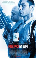
The "colorless except for red highlights" theme isn't just a horror cliché... it's heavily, sometimes tiresomely prevalent in modern film, where style has become so important. American Beauty is one of the most oft-cited narrative pieces to employ this trope, but make no mistake... it's everywhere. Check out the poster for Repo-Men, or the iconic little girl in Schindler's List. Also check out the current Apple Trailers page, where at least nine movies have dark or neutral color palettes, with a hard-hitting red element to draw focus. There's something about a red element on a moving canvas that captures in the mind of a stylist.

Call me a cynic, but I'm tempted to call the red-element trope a "trick"... a simple but undeveloped concept that provides an easy answer to what should be one of the toughest questions in making a film: how do I handle the colors in this world? How will they immerse the viewer, evoke an emotion, or represent the real world as closely as possible?

Luckily, some film stylists can generate more complex answers to that question. Avatar wasn't my favorite movie of last year, but at the very least, it was daring in its use of color: blue and green and gold, with touches of orange for body paint, were the iconic hues of a threatened forest world. If I needed a word to describe Cameron's palette, I'd call it "lush." Contrast that with Scorsese's use of colors in his new film Shutter Island, his most stylish to date, as far as I've seen. Here, he uses the concrete gray and faded green of an overcast island to contrast with the colors of hallucinations, bathed in the glow of a house-fire, envisioning the warm summer dresses and golden hair of a remembered wife. These colors are "overcast" versus "lurid," marking the contrasting mental states that the film balances.

Scorsese's use of a strong, mixed palette actually highlights the degree to which he abandons the classic horror/suspense tradition of emphasizing blood. When blood appears on Rachel's dress, it hardly even prompts a reaction, immersed as it is in a hallucinated world of rich, dark colors. Dr. Cawley's study is a deep red as well, and if it's blood Scorsese was trying to evoke, it wasn't the sudden splash of a gunshot... rather, it was the engrossing, pulsating bloody red of a womb. This is not a torture movie or a flashy horror piece. It's a series of paintings, rendered from Scorsese's imagination and passed in front of a camera lens.

It's worth emphasizing: creating a robust palette with a complex emotional presence, and being able to evoke multiple, often conflicting reactions at the same time... this is a difficult task. This month, I'll be seeing films whose color choices really say something, whether it's subdued, dreamlike, manic, depressing, or gilded. For each movie I see, I'll try to give the simplest descriptor possible for its essential color palette, although I'm probably going to stretch this rule significantly.

I'm going to start with Alice in Wonderland, which I'm excited for, especially now that I have a critical perspective through which to focus what will certainly be a mind-boggling experience. I'll also try to see I Love You Phillip Morris, The Eclipse, and maybe Repo Men and/or Clash of the Titans. I'll also go back to some classics, which may include any of the following: The Color of Pomegranates, Umbrellas of Cherbourg, Excaliber, The Red Shoes, Ashes of Time, Days of Being Wild, and something by Yasujiro Ozu.

As a final word, and a segue between Gritty February and Chromatic March, I offer the following, the palette review of Shutter Island.

Palette: "Overcast" / "Lurid"

Overcast


Lurid