
 Considering how long color has been a part of movie culture, I'm surprised by how little attention it gets from critics and reviewers. Doing a quick scan of reviews for The Crazies and Shutter Island, I saw very few references to color (none at all, actually, but that's not necessarily the final word). I assume The Crazies is carefully styled, with a gray ghost-town punctuated by splashes of red. Horror films all seem to do this now: it's either black and white (Let The Right One In) or deep blue (the Ring), and there's always an emphasis on the sudden bursts of red, because that's what indicates the intervention of the horrific. Horror is almost universally designed to trigger a few precise emotions: despair, alarm, and disgust. The color palettes tend to reflect this focus with pinpoint precision.
The "colorless except for red highlights" theme isn't just a horror cliché... it's heavily, sometimes tiresomely prevalent in modern film, where style has become so important. American Beauty is one of the most oft-cited narrative pieces to employ this trope, but make no mistake... it's everywhere. Check out the poster for Repo-Men, or the iconic little girl in Schindler's List. Also check out the current Apple Trailers page, where at least nine movies have dark or neutral color palettes, with a hard-hitting red element to draw focus. There's something about a red element on a moving canvas that captures in the mind of a stylist.
Call me a cynic, but I'm tempted to call the red-element trope a "trick"... a simple but undeveloped concept that provides an easy answer to what should be one of the toughest questions in making a film: how do I handle the colors in this world? How will they immerse the viewer, evoke an emotion, or represent the real world as closely as possible?
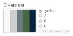
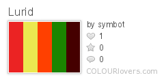
Luckily, some film stylists can generate more complex answers to that question. Avatar wasn't my favorite movie of last year, but at the very least, it was daring in its use of color: blue and green and gold, with touches of orange for body paint, were the iconic hues of a threatened forest world. If I needed a word to describe Cameron's palette, I'd call it "lush." Contrast that with Scorsese's use of colors in his new film Shutter Island, his most stylish to date, as far as I've seen. Here, he uses the concrete gray and faded green of an overcast island to contrast with the colors of hallucinations, bathed in the glow of a house-fire, envisioning the warm summer dresses and golden hair of a remembered wife. These colors are "overcast" versus "lurid," marking the contrasting mental states that the film balances.
 Scorsese's use of a strong, mixed palette actually highlights the degree to which he abandons the classic horror/suspense tradition of emphasizing blood. When blood appears on Rachel's dress, it hardly even prompts a reaction, immersed as it is in a hallucinated world of rich, dark colors. Dr. Cawley's study is a deep red as well, and if it's blood Scorsese was trying to evoke, it wasn't the sudden splash of a gunshot... rather, it was the engrossing, pulsating bloody red of a womb. This is not a torture movie or a flashy horror piece. It's a series of paintings, rendered from Scorsese's imagination and passed in front of a camera lens.
It's worth emphasizing: creating a robust palette with a complex emotional presence, and being able to evoke multiple, often conflicting reactions at the same time... this is a difficult task. This month, I'll be seeing films whose color choices really say something, whether it's subdued, dreamlike, manic, depressing, or gilded. For each movie I see, I'll try to give the simplest descriptor possible for its essential color palette, although I'm probably going to stretch this rule significantly.
I'm going to start with Alice in Wonderland, which I'm excited for, especially now that I have a critical perspective through which to focus what will certainly be a mind-boggling experience. I'll also try to see I Love You Phillip Morris, The Eclipse, and maybe Repo Men and/or Clash of the Titans. I'll also go back to some classics, which may include any of the following: The Color of Pomegranates, Umbrellas of Cherbourg, Excaliber, The Red Shoes, Ashes of Time, Days of Being Wild, and something by Yasujiro Ozu.
As a final word, and a segue between Gritty February and Chromatic March, I offer the following, the palette review of Shutter Island.
Palette: "Overcast" / "Lurid"
No comments:
Post a Comment